
Recycle Rover —
UX Case Study
Timeline: 10 weeks
Team: Yula Muhamadiva (Product Lead), Julie, Mariella, Marley
Role: Product Lead, UX Strategy, User Flows, Prototyping
Making recycling simple, accessible, and rewarding
Overview
Recycling isn’t convenient. Most people don’t know what can be recycled or where to take their items, which often leads to hazardous materials like batteries being thrown away. Even when people want to recycle, the process feels confusing and time-consuming.
Problem
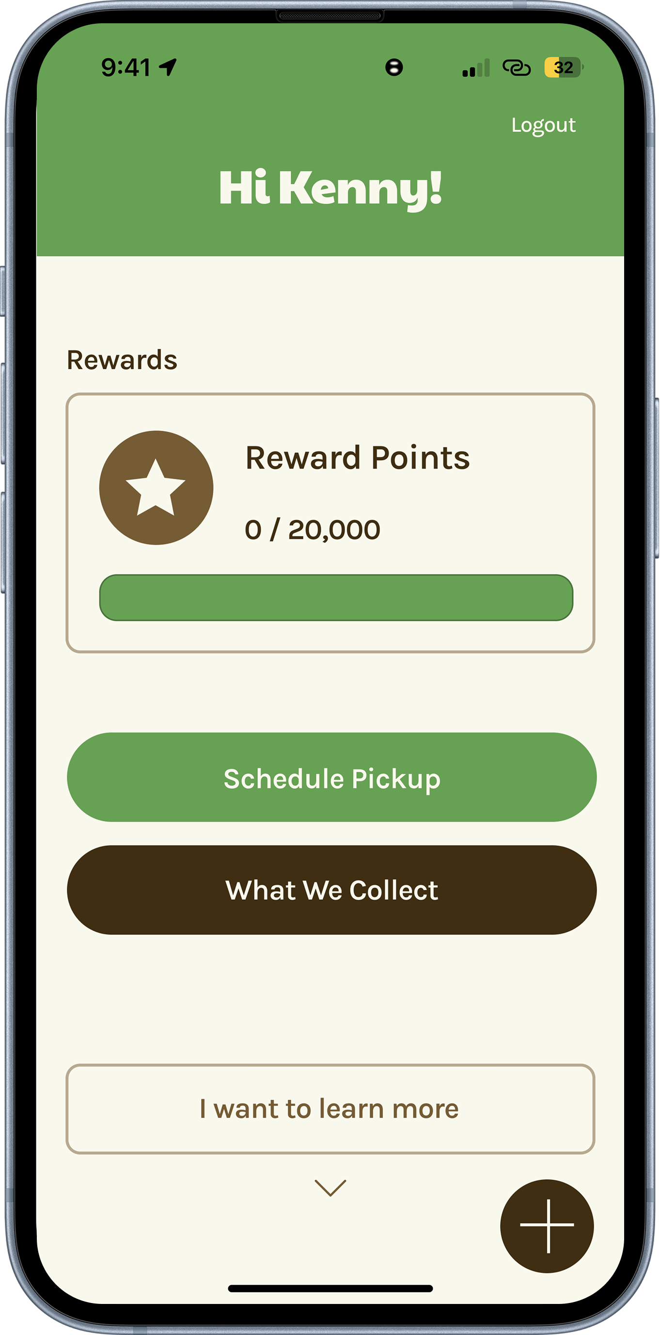
Recycle Rover was designed to simplify and streamline this experience by creating a mobile solution that supports users at every step. The app clearly communicates what items can be recycled, removing confusion and making information easy to access. It allows users to schedule a pickup within seconds, eliminating the need to search for drop-off locations or plan extra trips. Once a pickup is scheduled, users can track the process in real time, giving them visibility and confidence that their items are being handled properly. To encourage continued engagement, the app introduces a rewards system that motivates users to build sustainable habits over time, turning recycling into something that feels easy, rewarding, and part of everyday life.
Solution
The solution is to design a mobile experience that clearly shows what items can be recycled, allows users to schedule pickups in seconds, provides real-time pickup tracking, and rewards users for sustainable behavior.
Use Flow Diagram
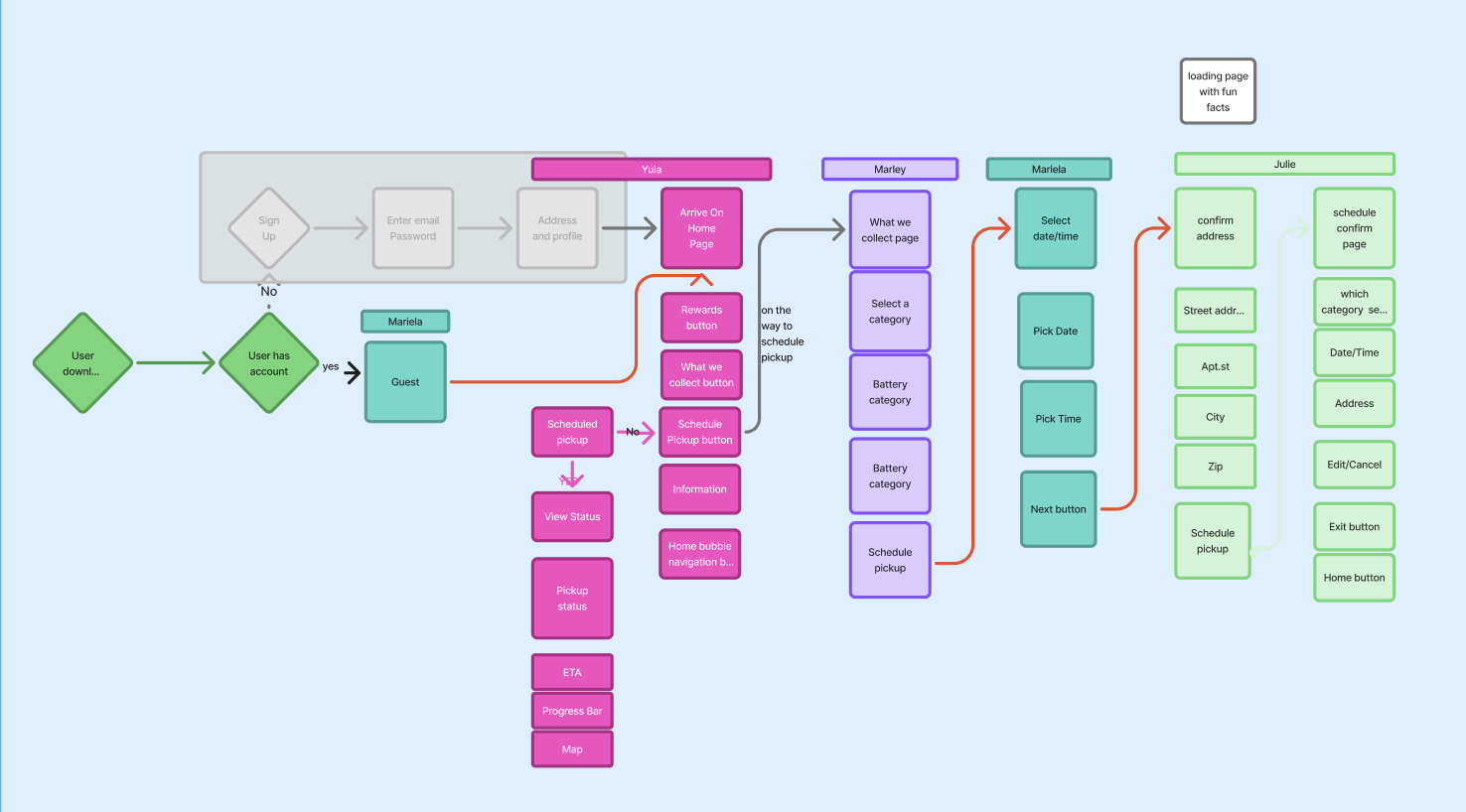
The user journey begins with signing up or logging into the app, after which the user lands on the home page. From there, the user selects the “Schedule Pickup” option and chooses a recycling category. The user then enters their address, selects a preferred date and time, and confirms the booking. After scheduling, the user can track the pickup in real time and eventually earn rewards once the process is completed.
Paper Prototyping
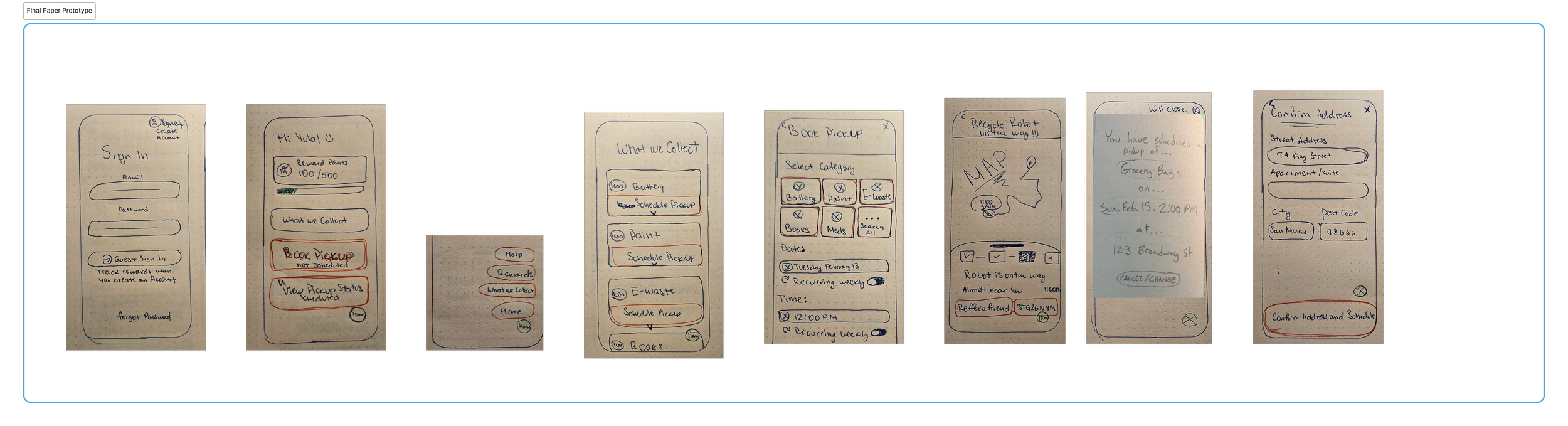
The design process began with low-fidelity paper prototypes, which allowed us to quickly map out core flows and test different navigation ideas. This stage made it easy to iterate rapidly and refine the structure before moving into digital design.
1. Schedule Pickup
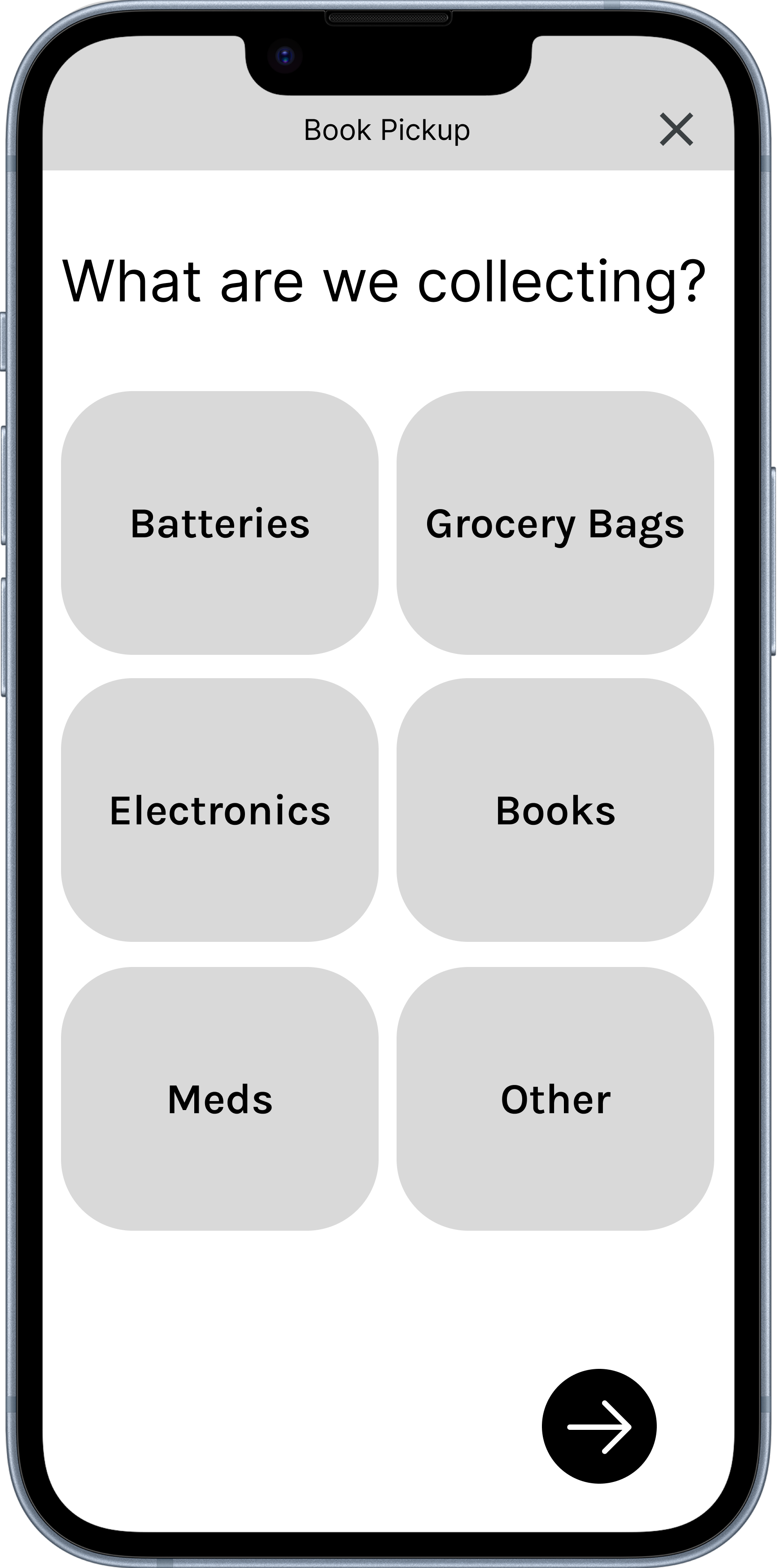
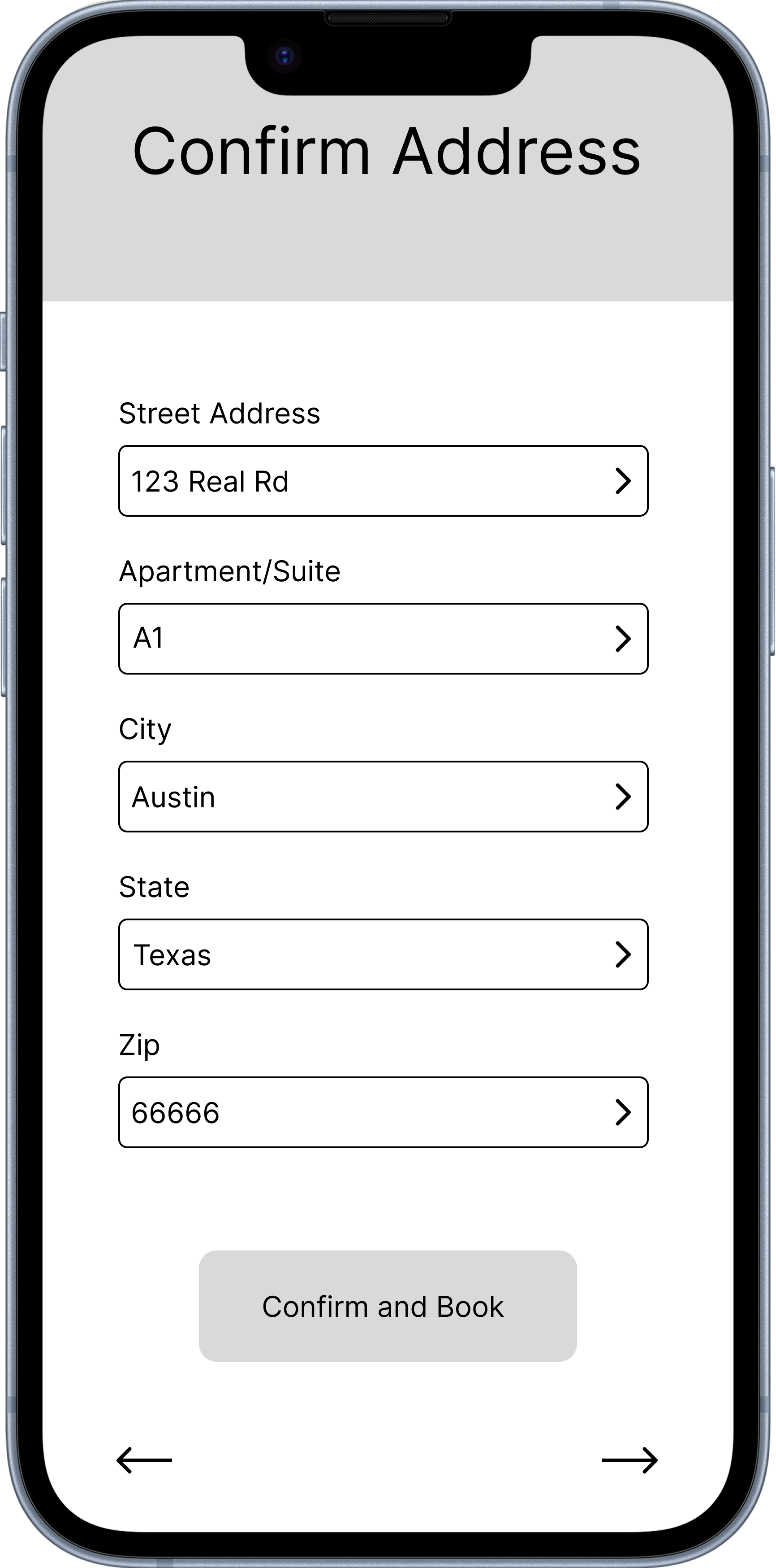
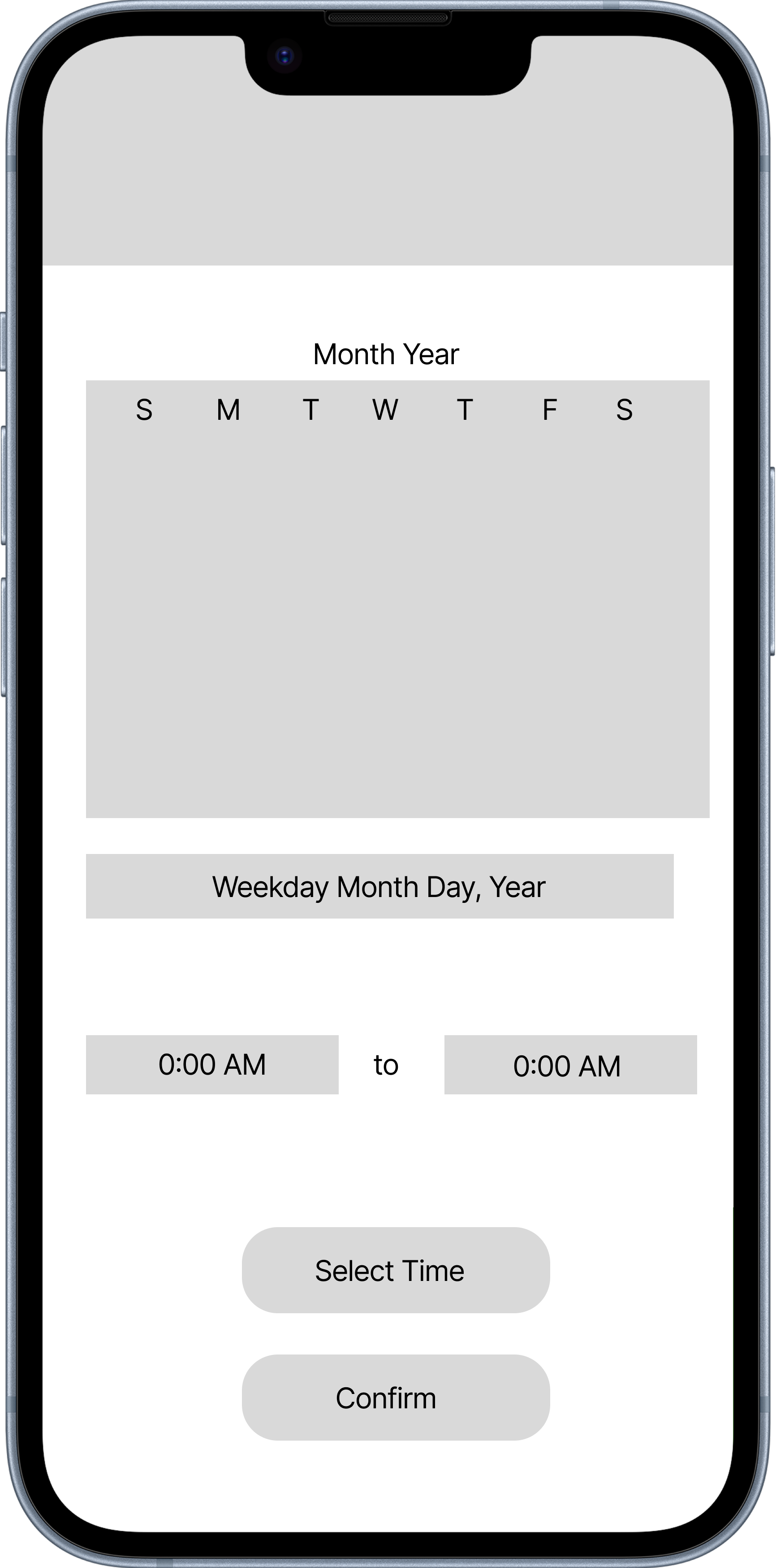
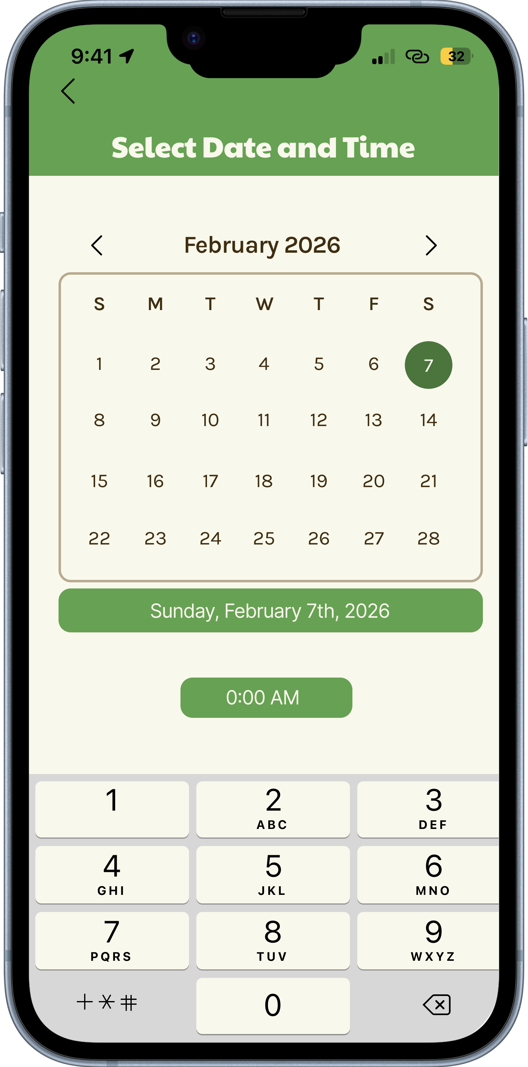
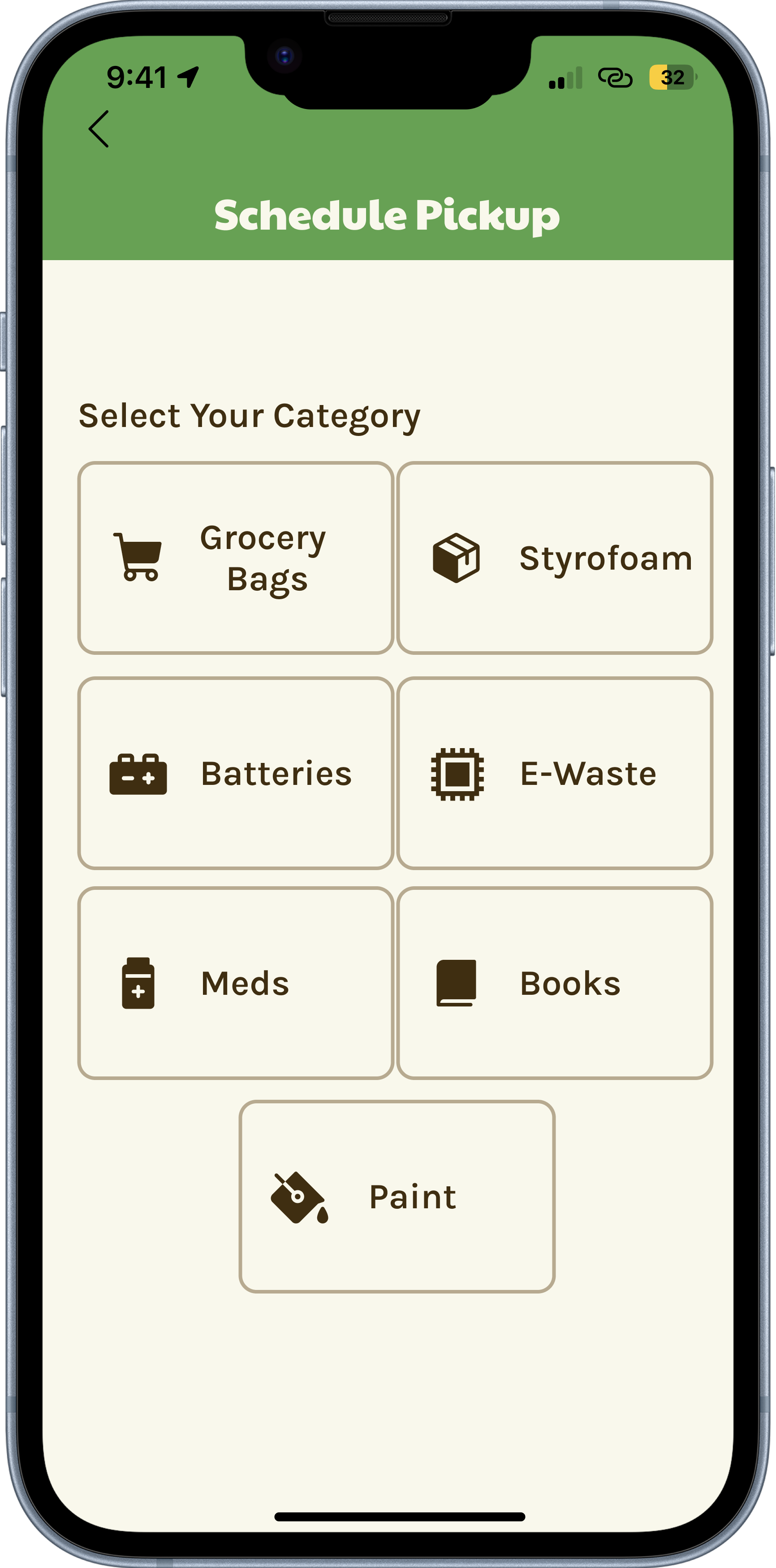
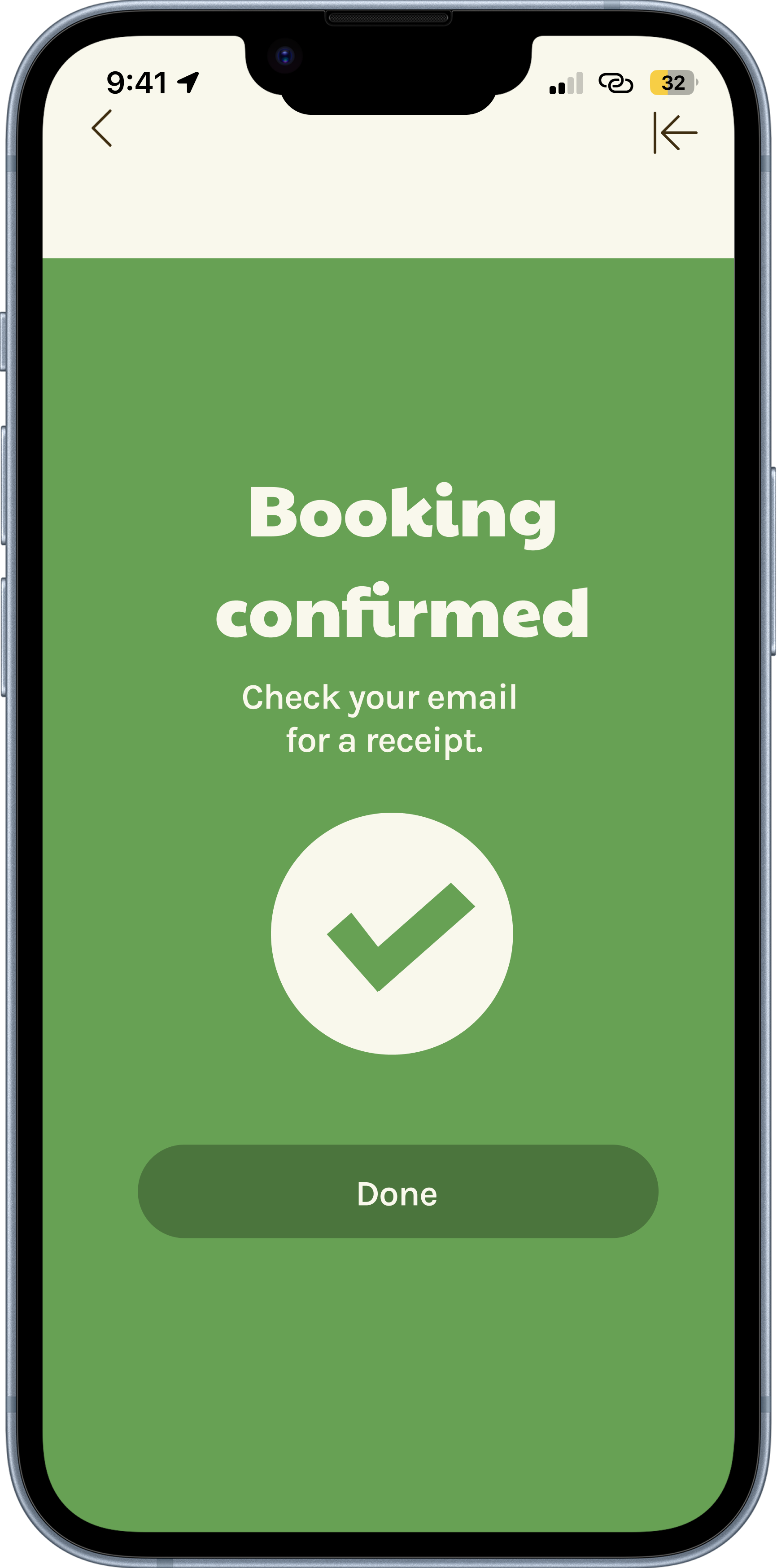
The scheduling feature allows users to quickly set up a recycling pickup in just a few steps. Users begin by selecting a recycling category, then enter their address details, choose a date and time, and confirm their pickup. This flow was designed to reduce friction and turn what is normally a complicated process into something simple and fast.
2. What We Collect
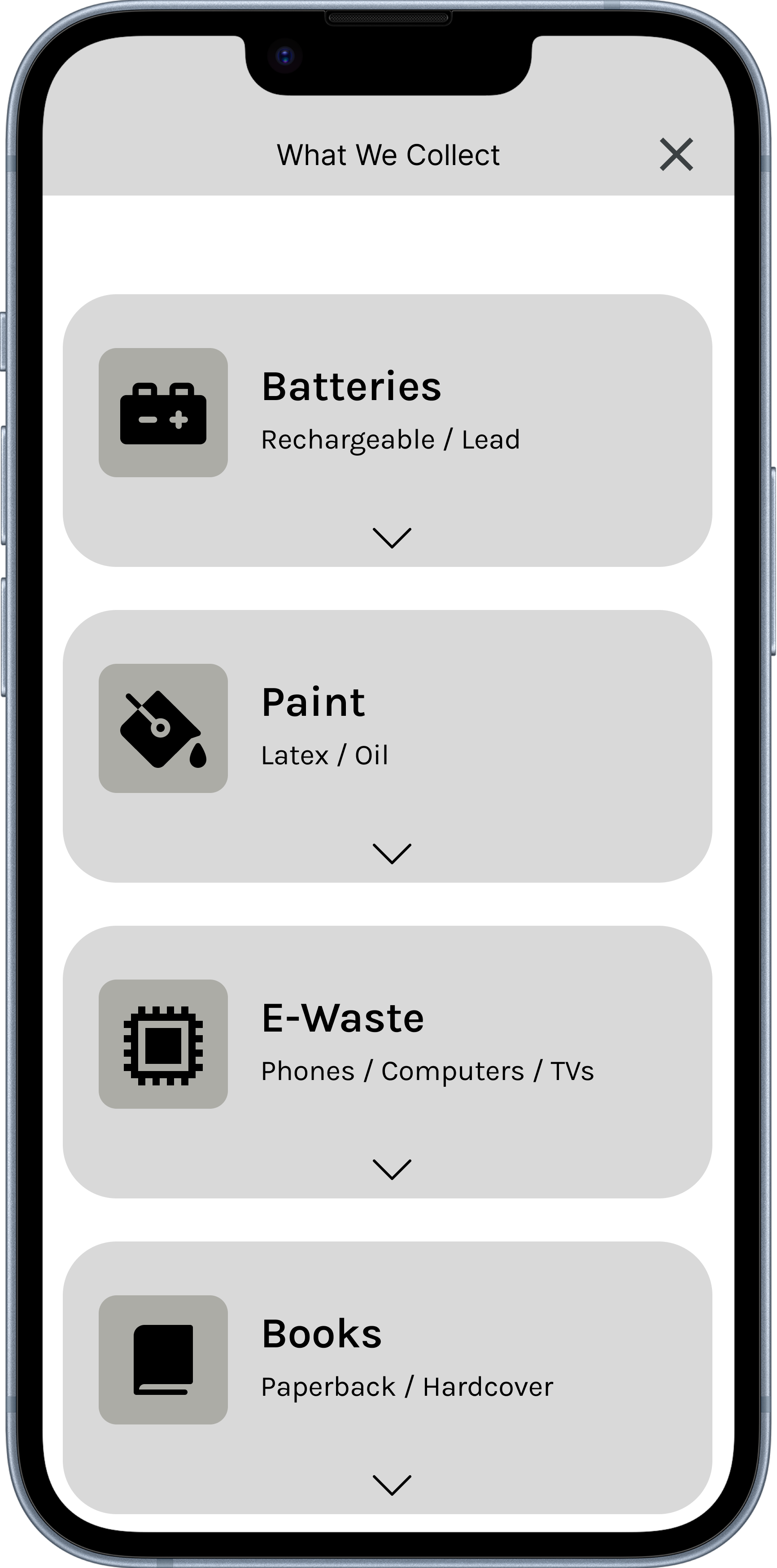
The “What We Collect” section was designed to educate users on what items can be recycled. It includes categories such as batteries, electronics, grocery bags, books, medications, and other materials. Each category provides short, clear explanations to help users understand how to properly dispose of items and why it matters.
3. Pickup Tracking
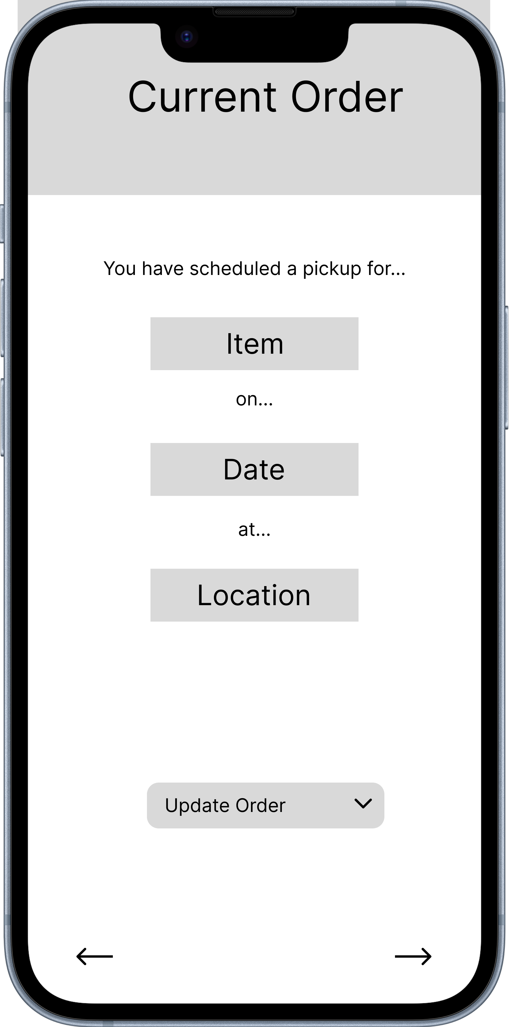
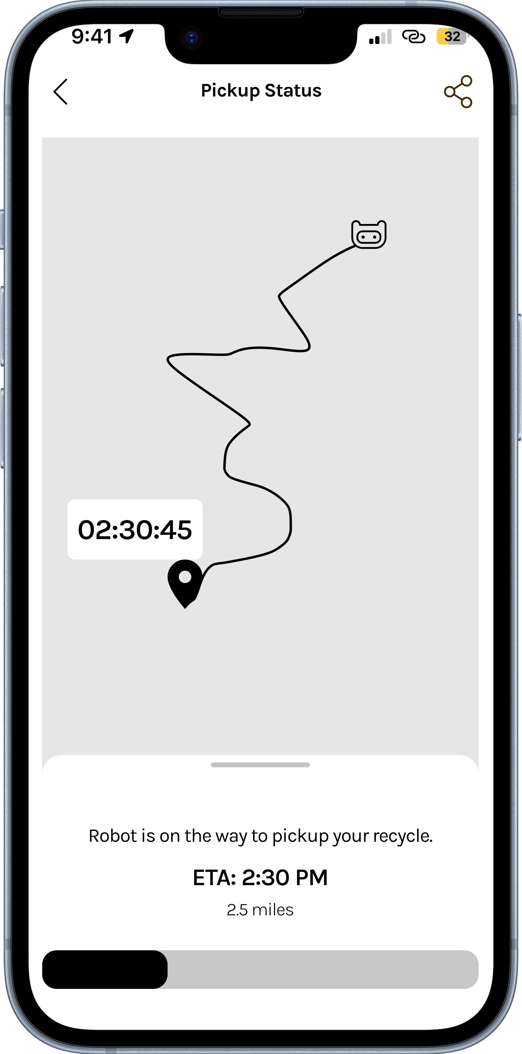
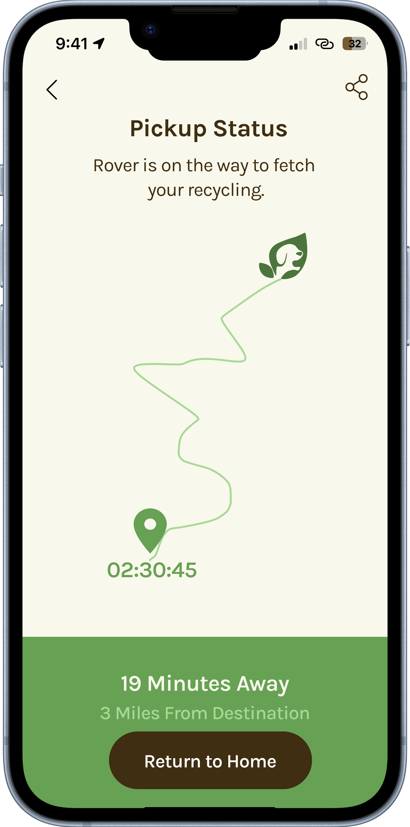
Once a pickup is scheduled, users can track their order in real time. The app allows users to view their current order, monitor the pickup status, and see estimated arrival times and location updates. This feature was designed to increase trust and give users full visibility into the process.
4. Rewards System
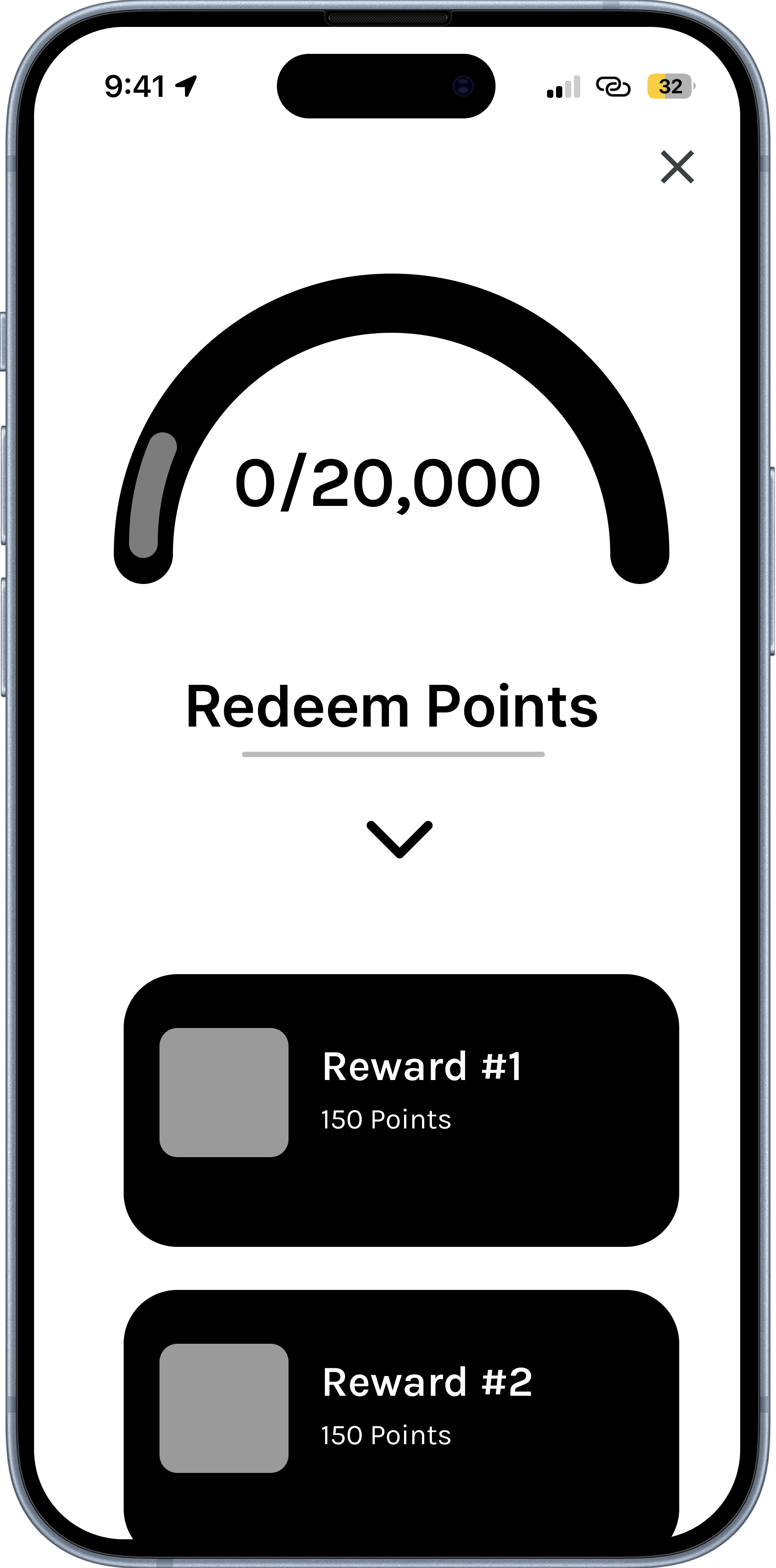
To encourage long-term engagement, the app includes a rewards system that gives users points for recycling. Users can track their progress toward a larger goal, view their accumulated points, and redeem rewards. Badge-style achievements were also explored to make the experience more engaging.
Iteration & Feedback
During the iteration phase, we explored multiple versions of key features, including different layouts for date and time selection, variations in category selection, and different reward system designs. One key insight was that users responded positively to both progress bars and badge icons, which led us to combine these elements into a single, more engaging rewards experience.
High-Fidelity Design
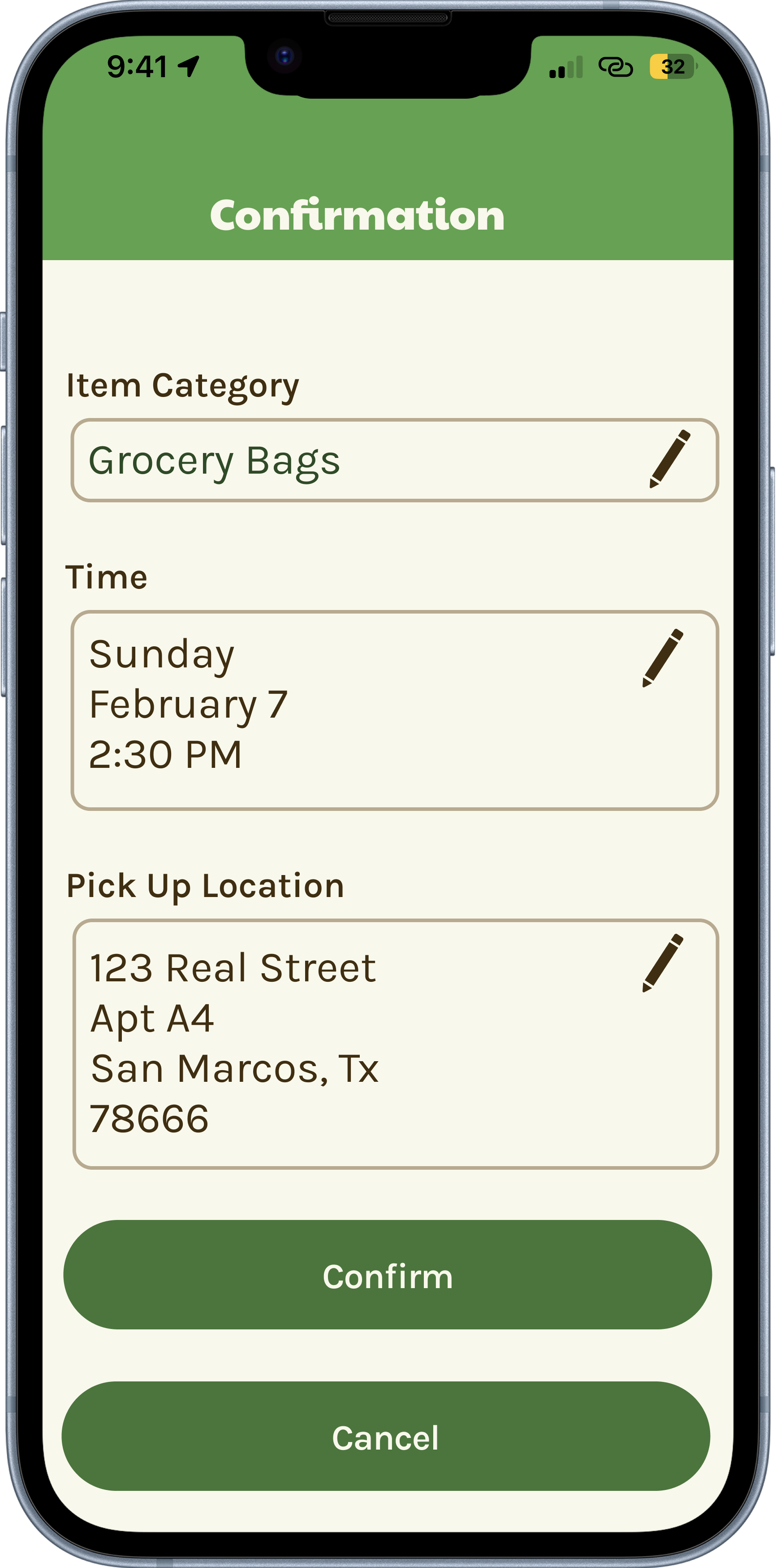
The final designs focused on creating a clean and modern mobile experience with a clear visual hierarchy. Navigation was simplified into key sections such as home, scheduling, and rewards. The overall tone was designed to feel friendly and approachable while still being functional.
Key Insights
Through this project, we learned that users value clarity over complexity and prefer experiences that are easy to understand at a glance. Educational content is most effective when it is quick and visual rather than text-heavy. Trust is significantly improved when users can see real-time updates, and reward systems play a strong role in encouraging repeated engagement.
Challenges
One of the main challenges was balancing education with simplicity, ensuring users received enough information without feeling overwhelmed. Another challenge was designing flows that felt fast while still including necessary steps. Maintaining consistency across multiple features and screens also required careful attention throughout the process.
What I Learned
This project reinforced the importance of strong user flows in making complex systems feel simple. It also showed how gamification can influence real behavior change. As a product lead, I learned that clarity in direction is more important than control, and that the best design outcomes come from continuous iteration.
Next Steps
The next steps for this project include refining the reward system interactions, improving real-time map tracking, conducting usability testing with real users, and expanding the range of recyclable categories supported within the app.