

Find the Hidden Side of Uzbekistan.
Explore Tashkent Like a Local — Even Offline.
UzGO App Design
Timeline: 10 weeks
Design Role: Design Lead, Product Research
Project Description: Developing an offline-first travel app for exploring Tashkent, providing metro maps, hidden local spots, curated tips, and authentic tour bookings so visitors can experience the city like a local without internet access.
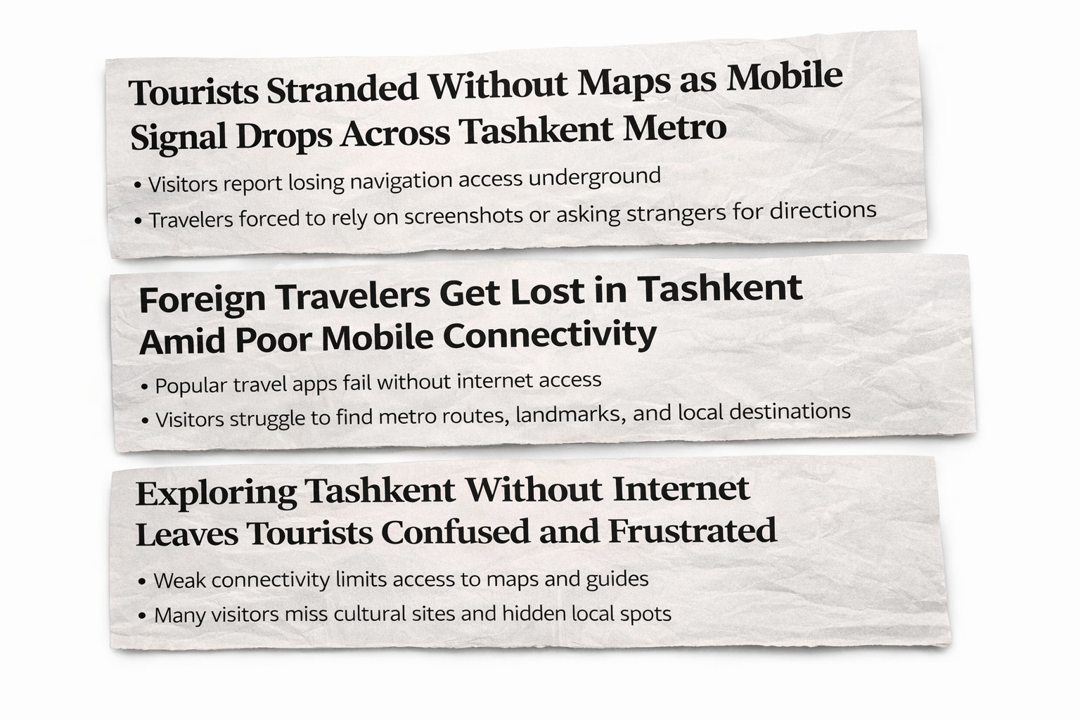
PROBLEM DISCOVERY
This is a common issue for travelers visiting Tashkent.
Many navigation and travel apps rely on internet connectivity, which can be unreliable throughout the city.
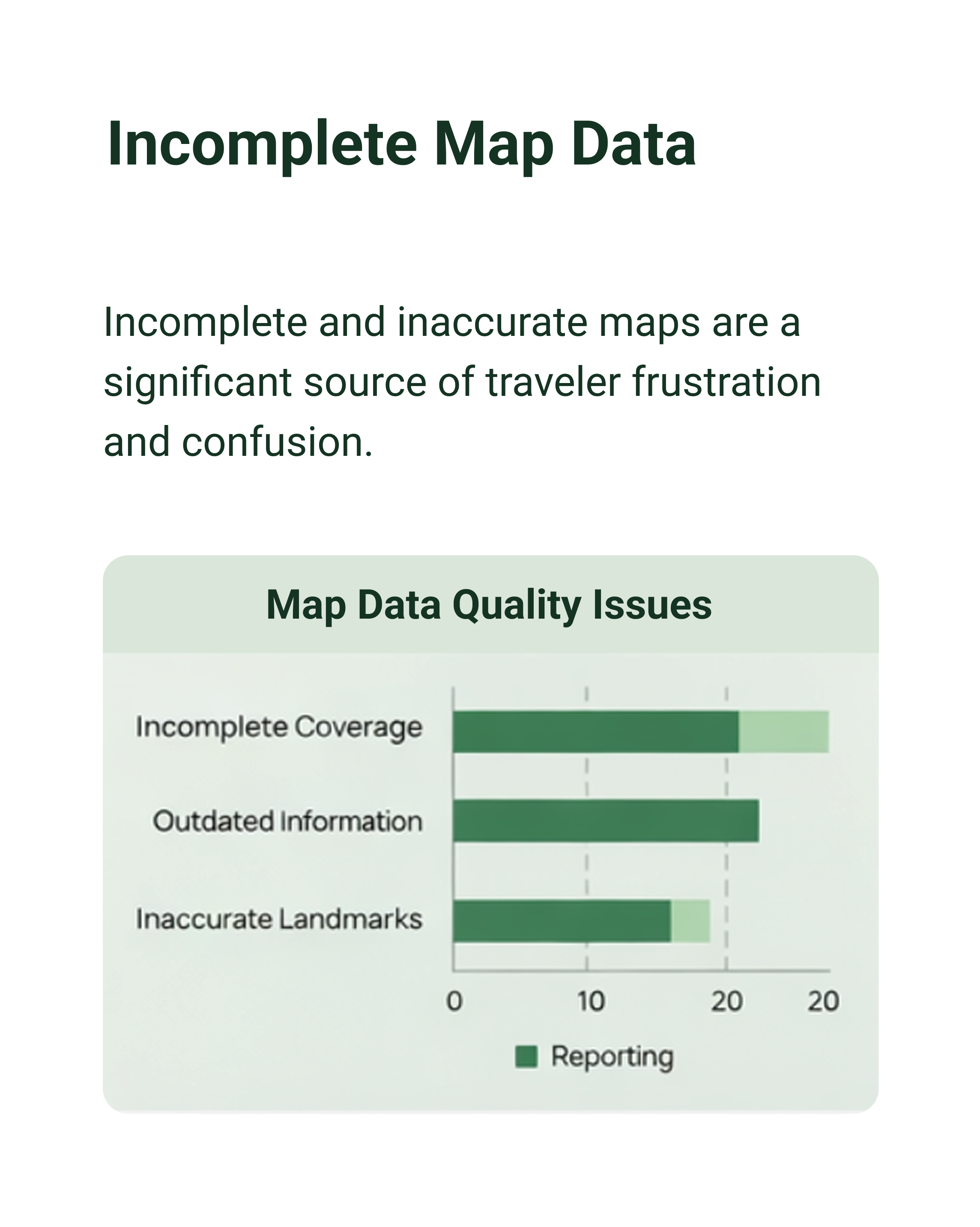
Without stable service, visitors struggle to access metro routes, maps, and key landmarks, leading to confusion and frustration while trying to explore.
PROBLEM STATEMENT
Navigation in Tashkent is unreliable for travelers due to weak connectivity and incomplete offline maps, making it difficult to access metro routes, landmarks, and essential directions when internet service is unavailable.
SOLUTION
UzGo provides reliable offline navigation for travelers in Tashkent by offering downloadable maps, full metro and landmark coverage, smart prompts for missing areas, and automatic updates, allowing visitors to explore the city confidently without internet access.
RESEARCH
Travelers rely heavily on mobile apps for navigation and discovering experiences while exploring new cities.
To better understand user behavior, I conducted a survey using Google Forms with 39 participants. The goal was to learn how travelers navigate cities, what challenges they face, and what features they value most. This helped me identify real user pain points and move beyond assumptions.
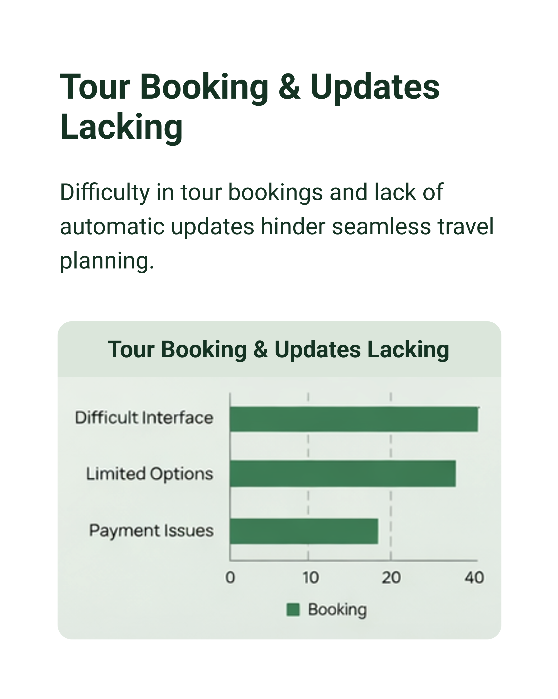
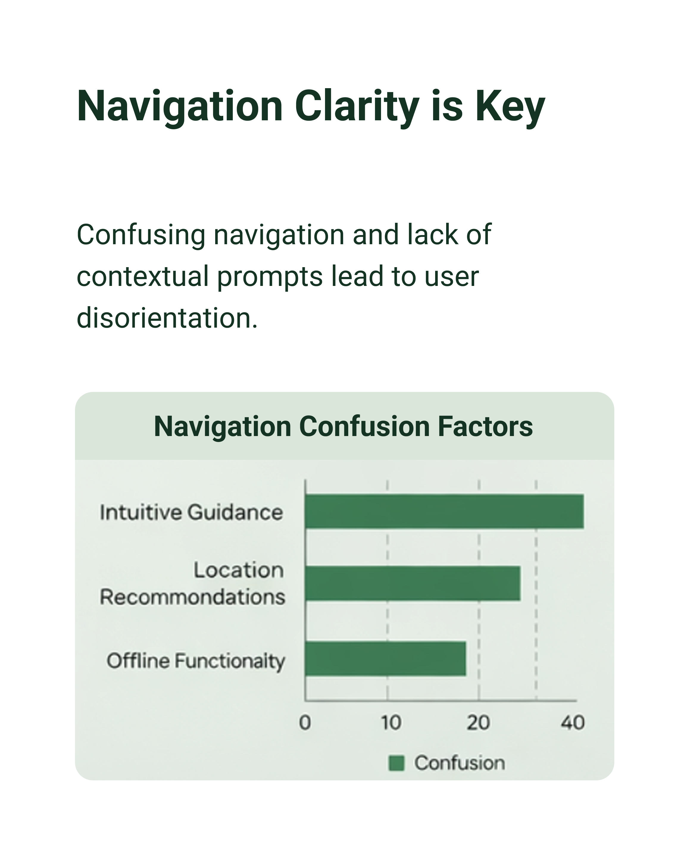
Here are some key findings:

Competitive Analysis
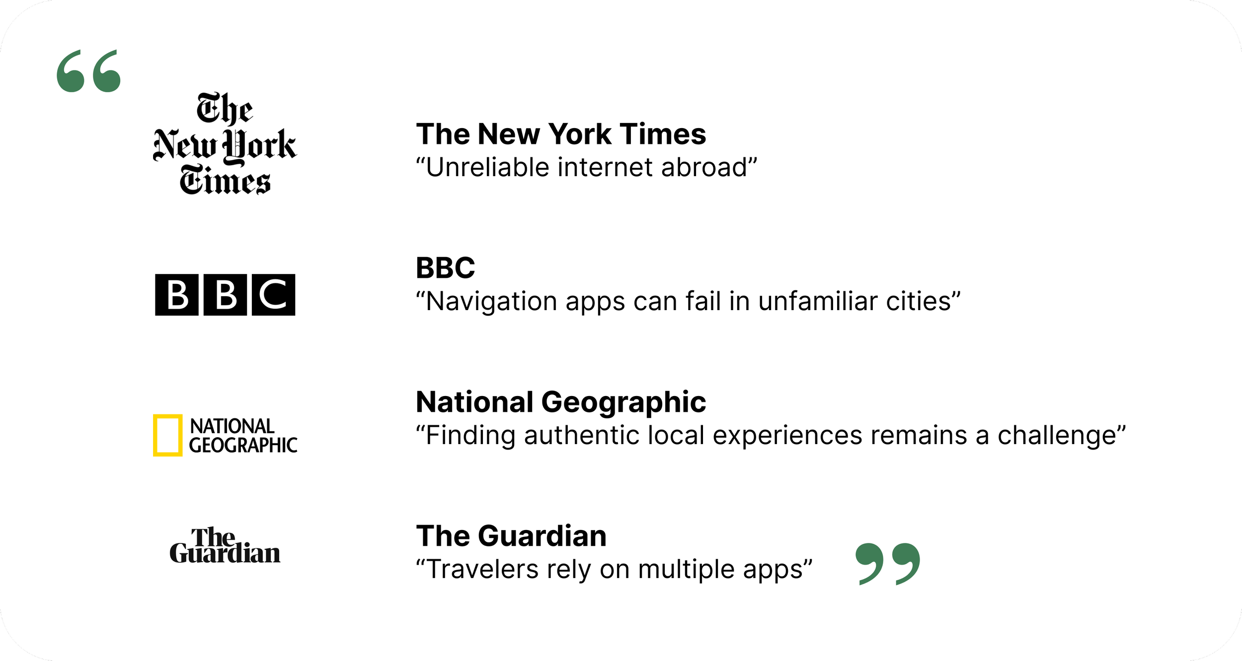
Evaluating TripEase and GlobeMate revealed the same pattern seen across travel today—unreliable navigation, scattered information, and dependence on multiple tools.
While these platforms offer core features like booking, rewards, and payments, they fall short in speed, accuracy, and reliability.
Instead of simplifying travel, they create a fragmented experience in which users must piece everything together themselves.
Persona / Interview
To make the problem more real, I created a persona based on patterns from my research.
Lola represents travelers visiting Tashkent who rely heavily on their phones to navigate, plan, and discover new places. Across my findings, people struggled with unreliable information, scattered tools, and difficulty finding local experiences.
She wants a smoother, more intuitive way to explore—something that brings navigation, recommendations, and planning into one place without the usual confusion.
“Finding reliable information about Tashkent is harder than it should be. I just want everything in one place so I don’t have to jump between apps.”
— A.K., traveler“I want to explore local spots and hidden places, but it’s hard to find them unless someone tells you about them.”
— A.M., traveler“I never know if the information I’m seeing is up to date, so I end up double-checking everything or wasting time going to places that are closed.”
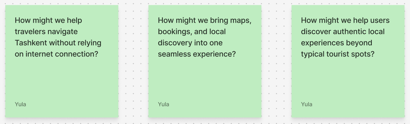
— T.J., travelerDirectional Solutions
As I started to better understand the problem space, I used How Might We questions to reframe key pain points into opportunities for design
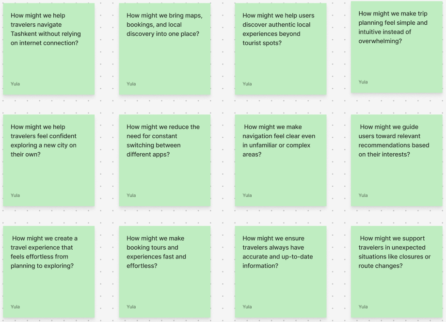
Narrowed down to focus on three
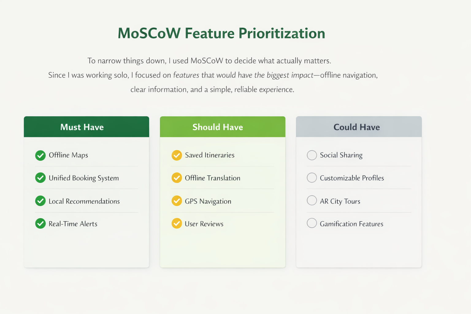
MoSCoW Feature Prioritization
To narrow things down, I used MoSCoW to decide what actually matters.
Since I was working on this alone, I didn’t want to try to build everything. Instead, I focused on the features that would have the biggest impact—like offline navigation, clear information, and making the overall experience simple and reliable.
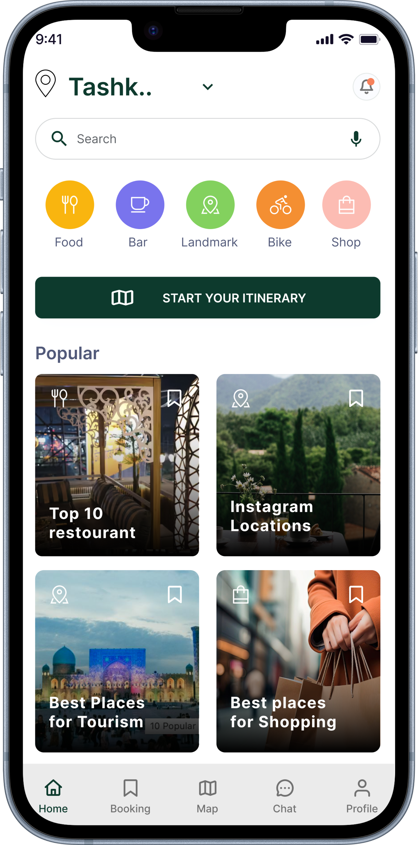
FINAL SOLUTION
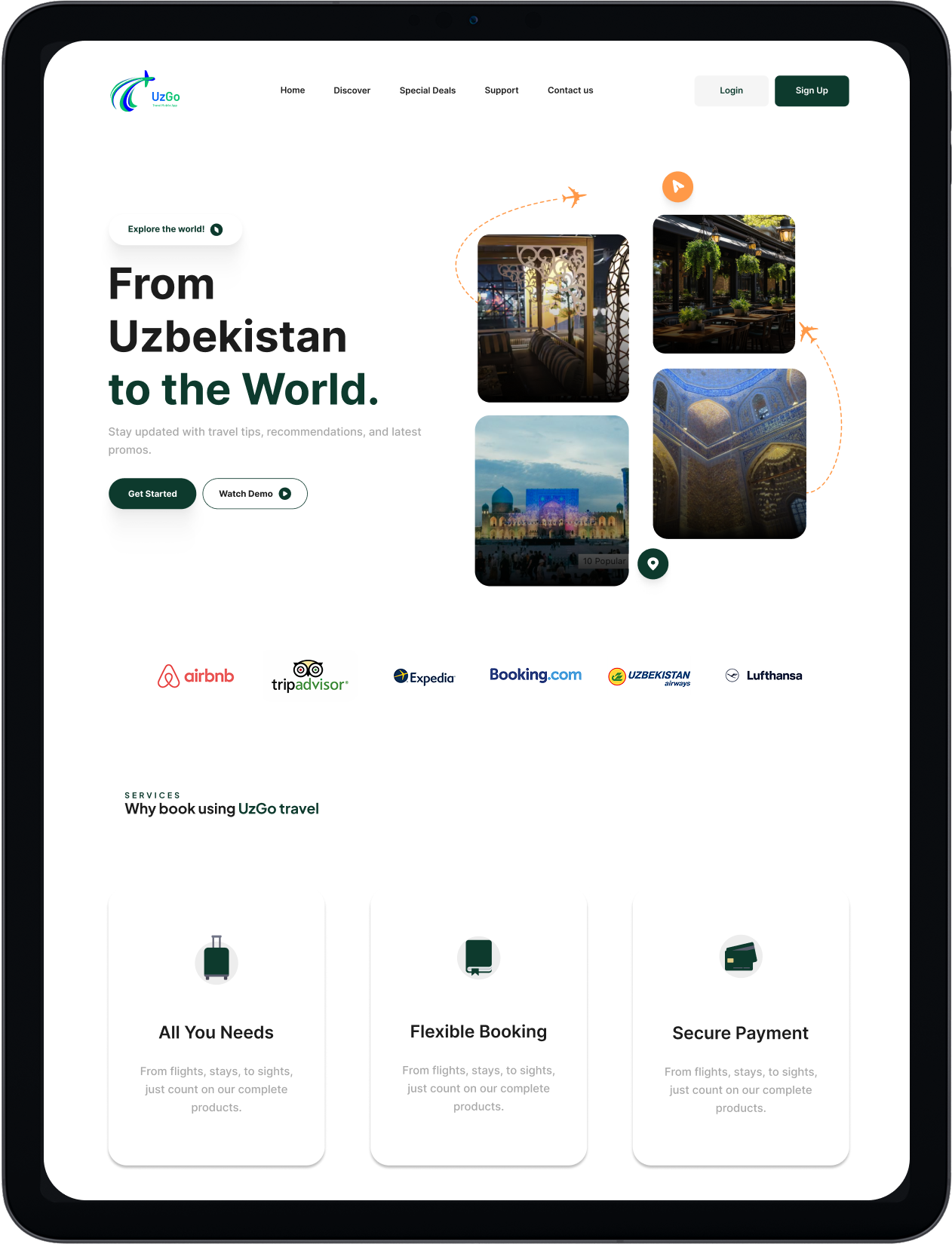
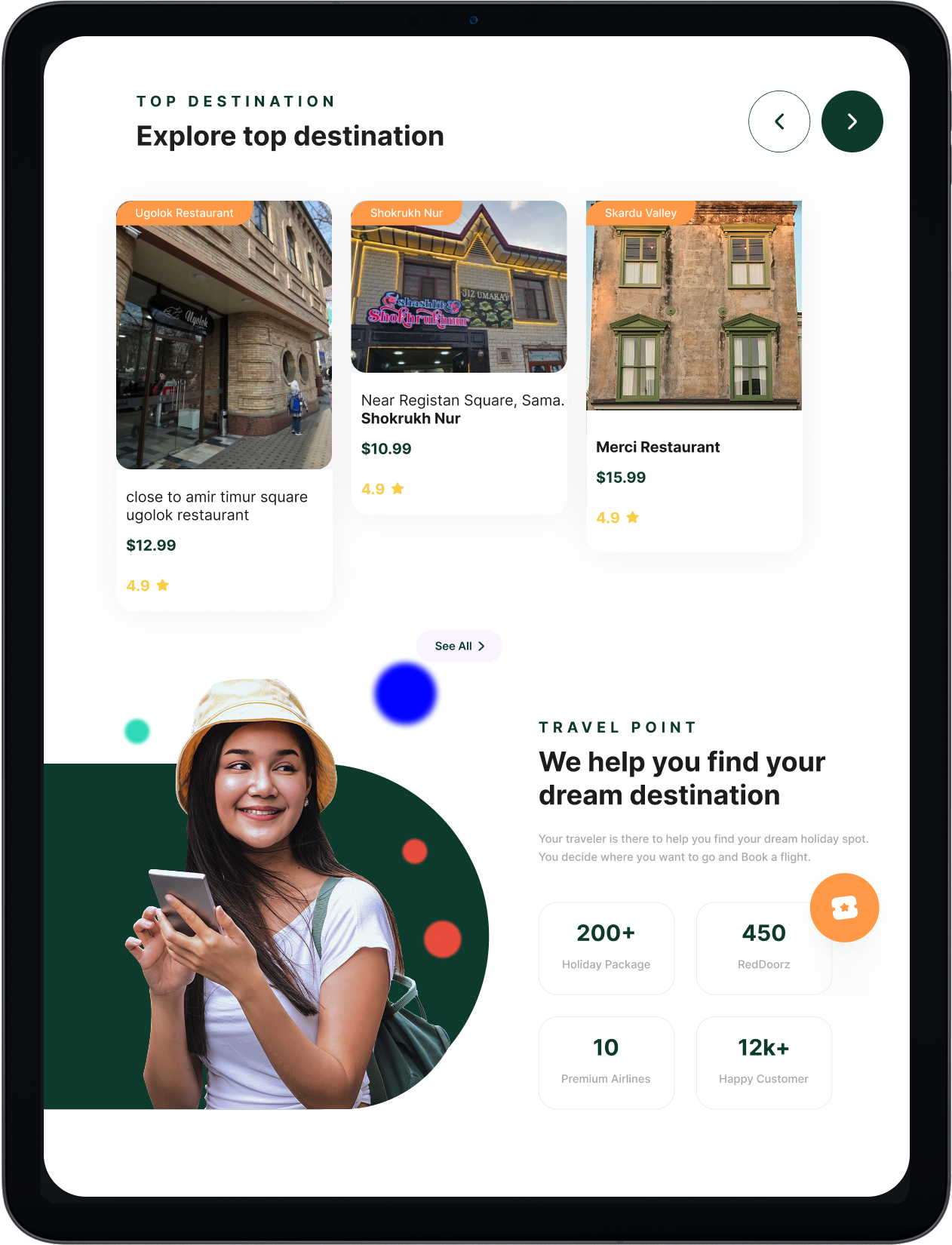
One app for navigating, discovering, and planning Tashkent
UzGo brings navigation, discovery, booking, and trip planning into one place—so travelers can explore Tashkent with clarity and confidence.
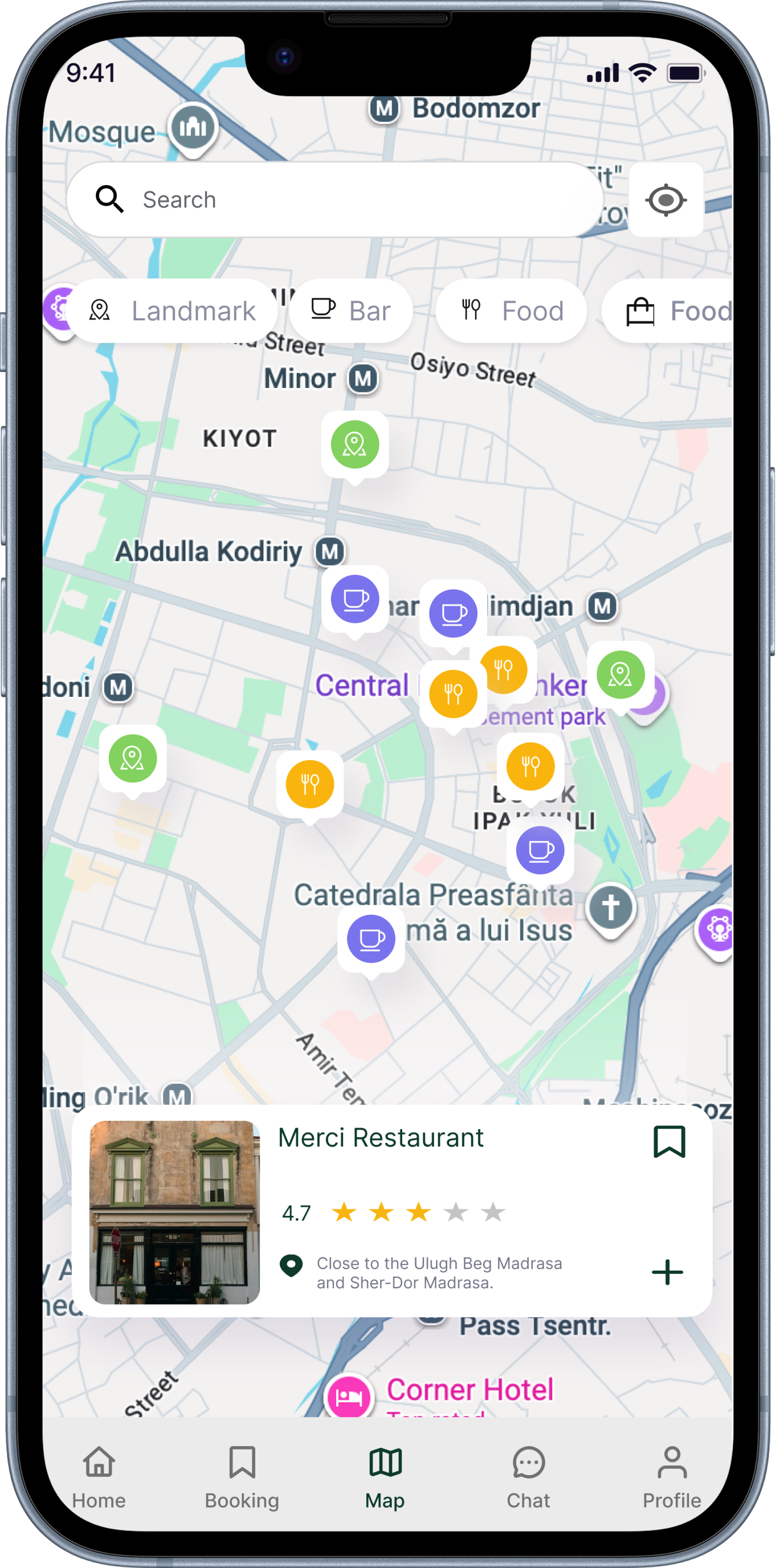
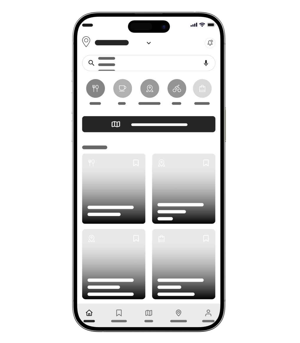
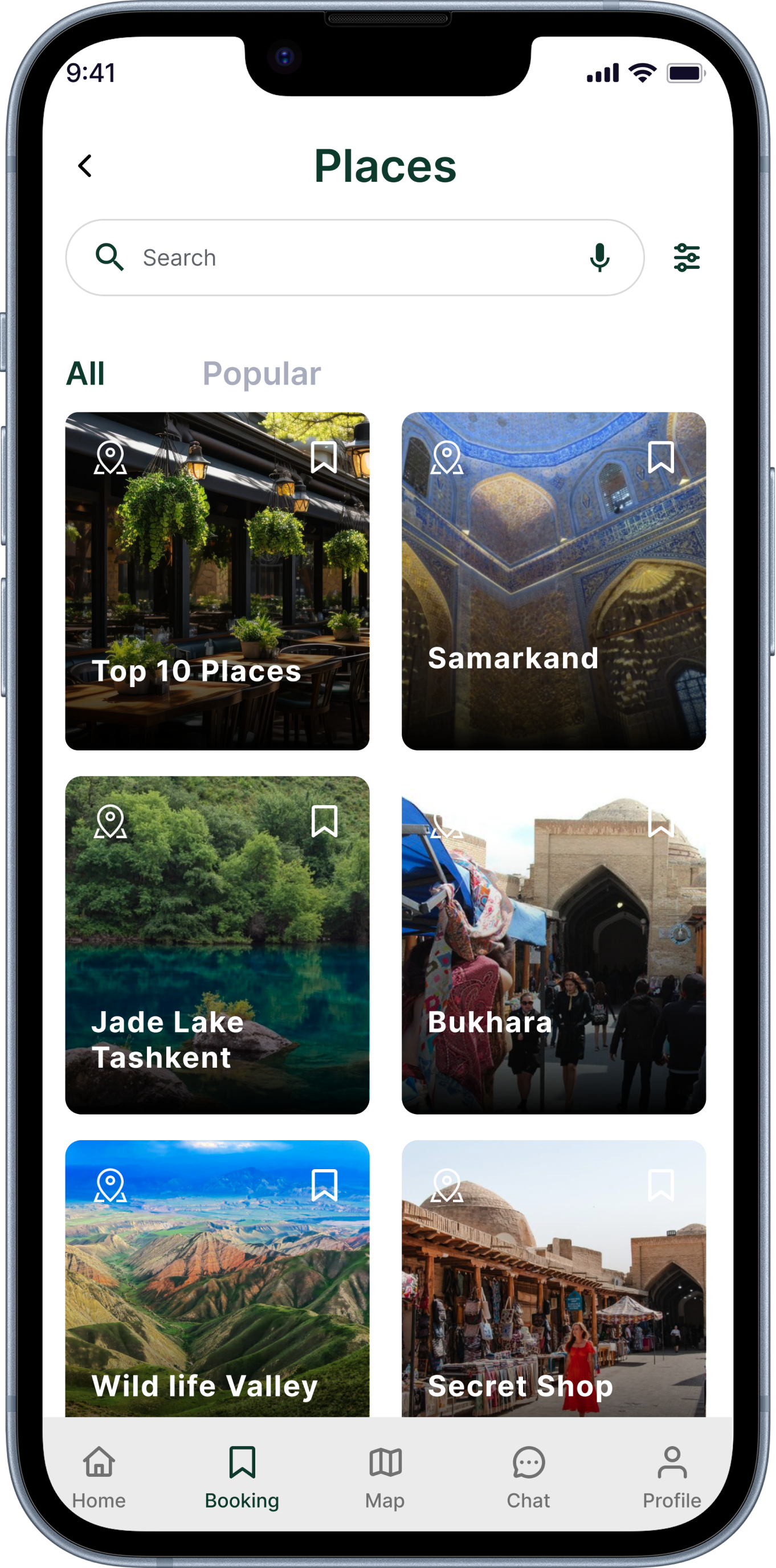
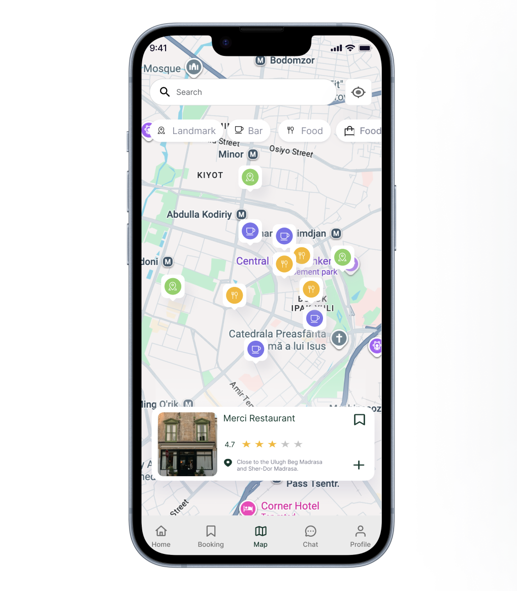
How does UzGo stand out in navigation?
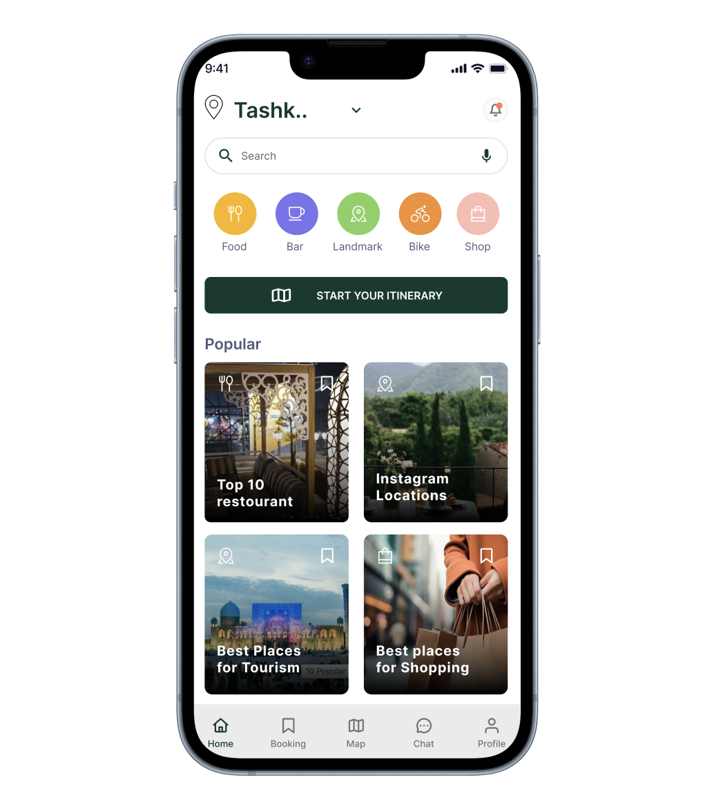
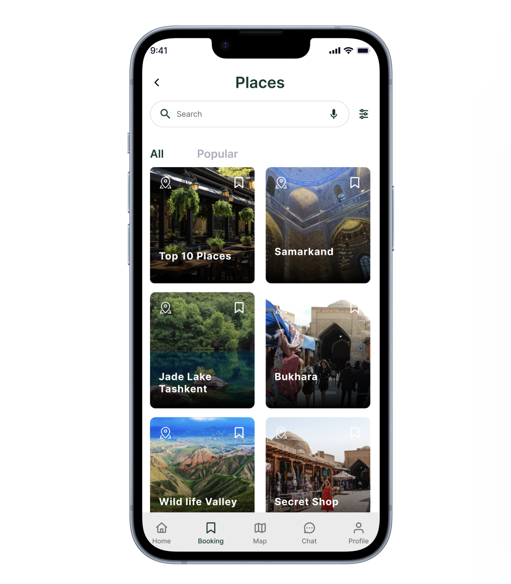
UzGo combines navigation and discovery into one screen, allowing users to search, filter, and explore places around them in real time.
Instead of switching between apps, users can view locations, compare options, and take action—all within one continuous experience.
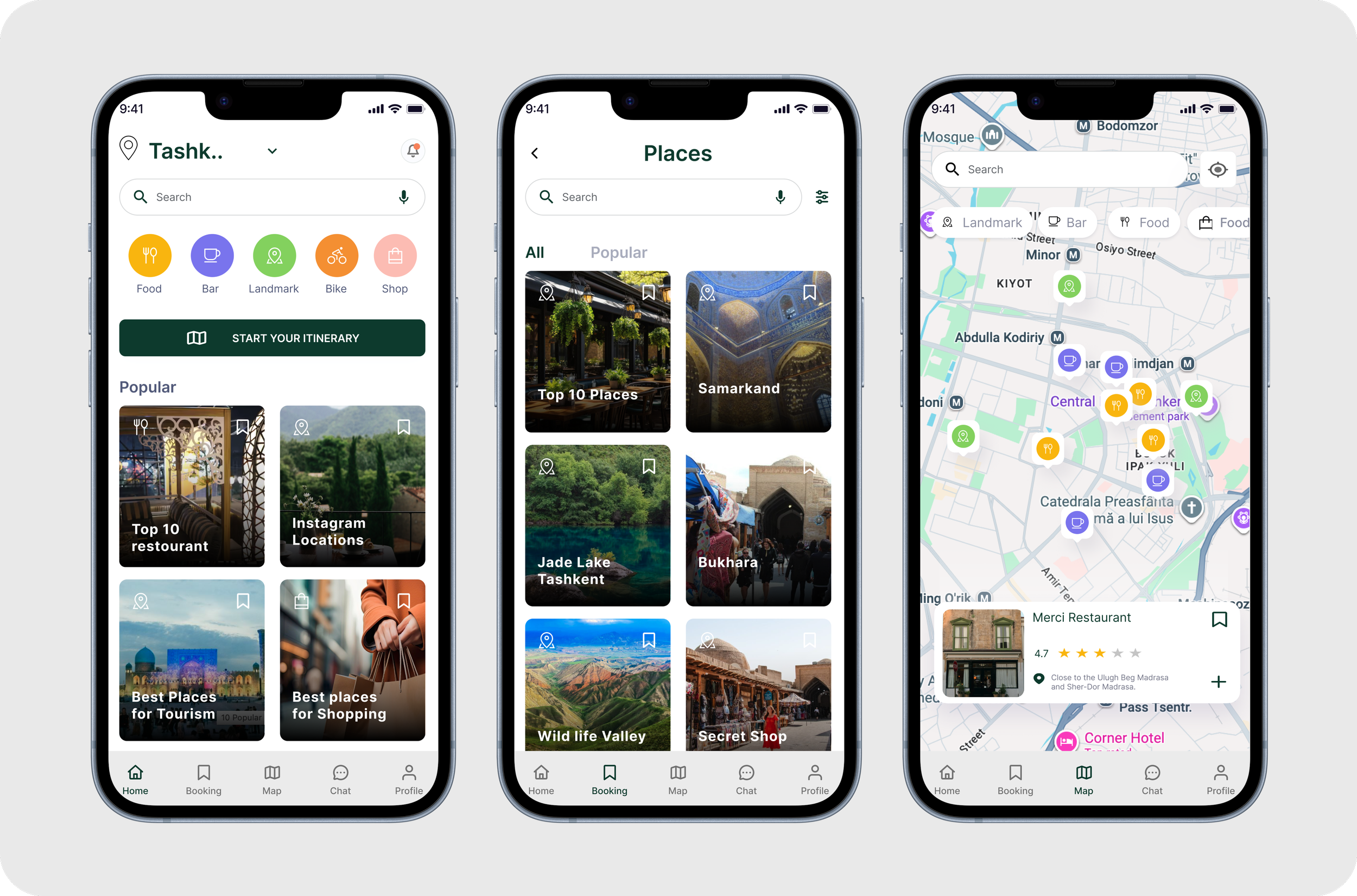
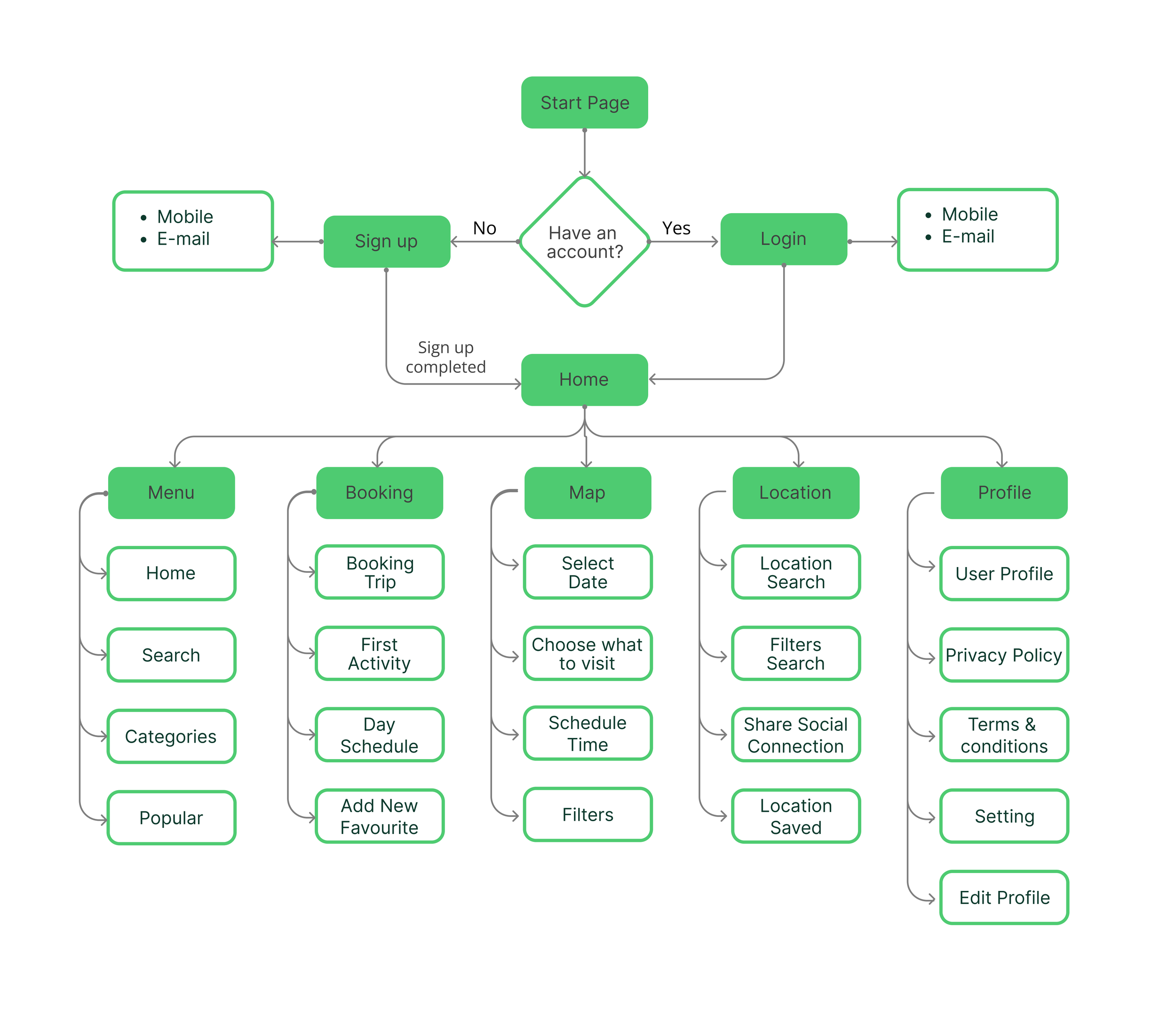
User Flow
I mapped how users move through UzGo from sign-in to exploring, planning, and booking. The goal was to keep everything simple and connected so users can navigate the app without confusion.
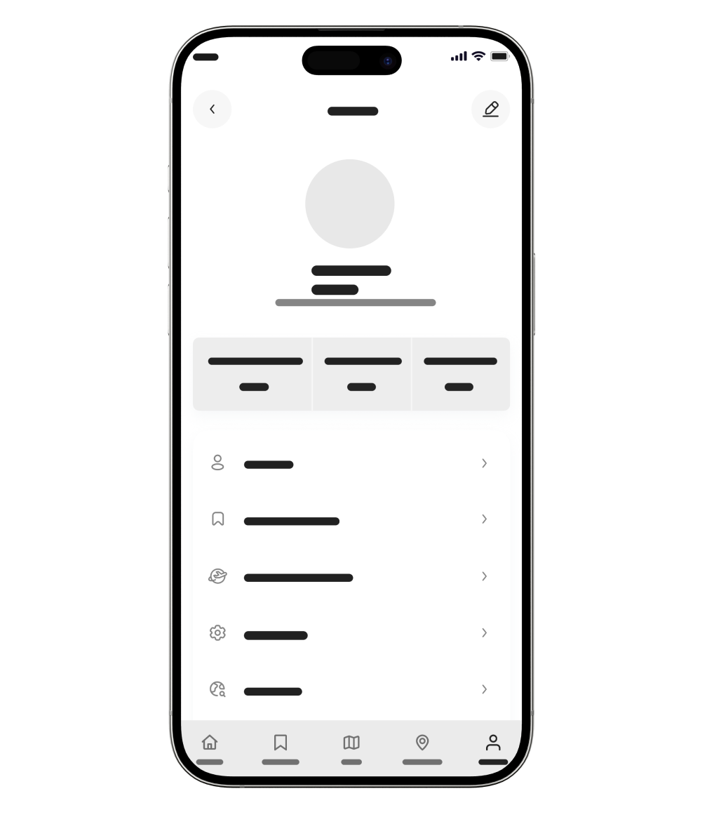
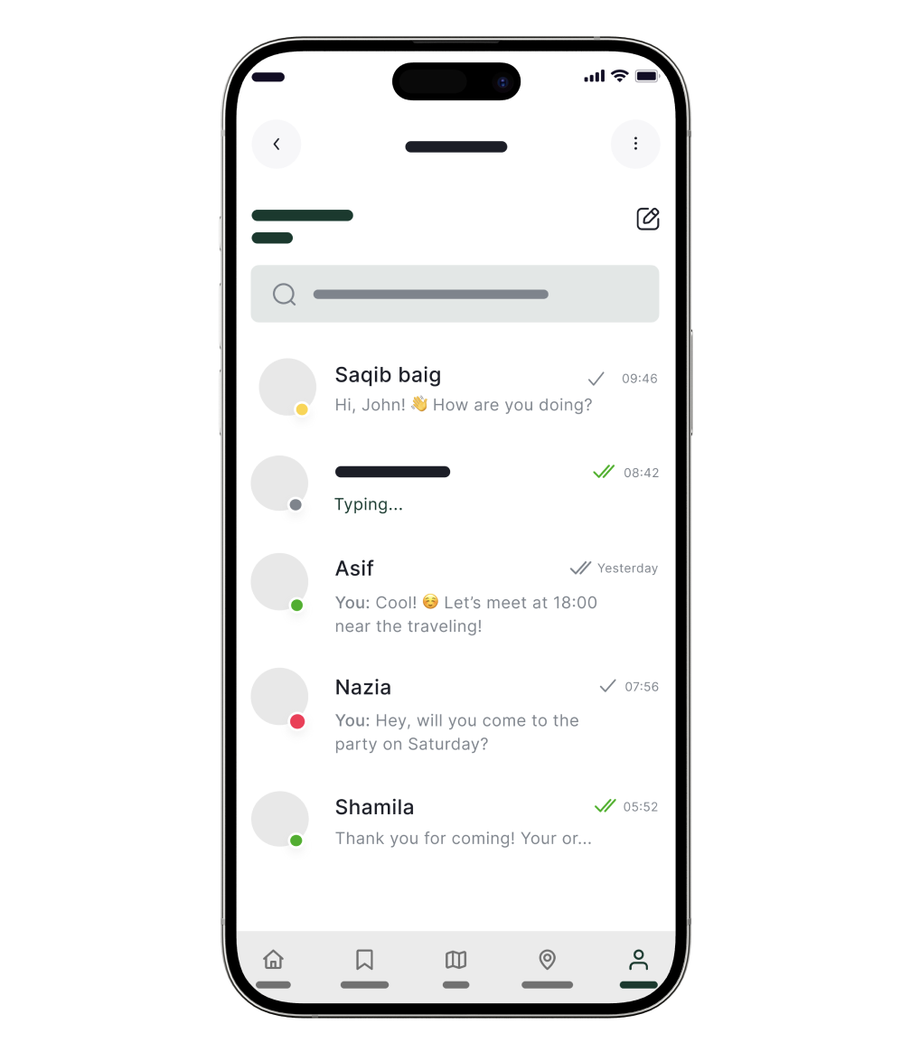
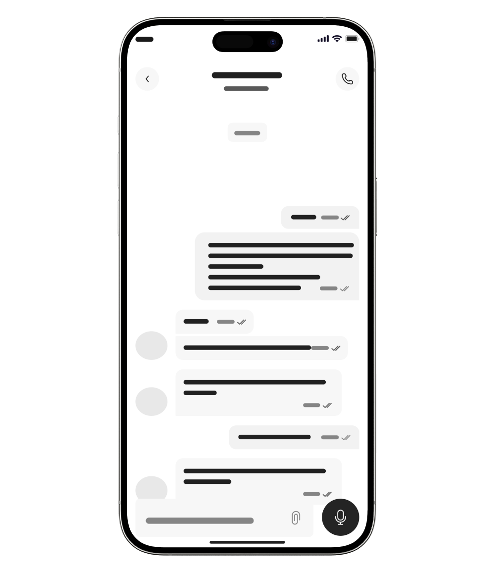
DESIGN
Wireframes
When I started designing the wireframes for UzGo, I focused on one main problem—travelers were constantly switching between apps to piece together information that should’ve been in one place. The experience needed to feel simple and easy to follow, especially in a new city, so users can search, explore, and plan without overthinking.
I brought navigation, discovery, and planning into one connected experience, instead of separating maps, places, and booking. Everything is designed to be clear and easy to scan—so users can quickly understand their options, make decisions, and keep moving without breaking their flow.

User Testing
After building the high-fidelity screens, I tested the flows to see what felt intuitive and what needed improvement. The goal was to understand how easily users could explore, plan, and navigate through the app.
Positives
Users were able to quickly understand how to explore places and navigate through the map.
To be improved
Some users were unsure where to start when landing on the home screen.
The relationship between map, places, and booking could feel unclear at first.
Navigation between sections needed to feel more consistent.
ITERATIVE DESIGN DECISION
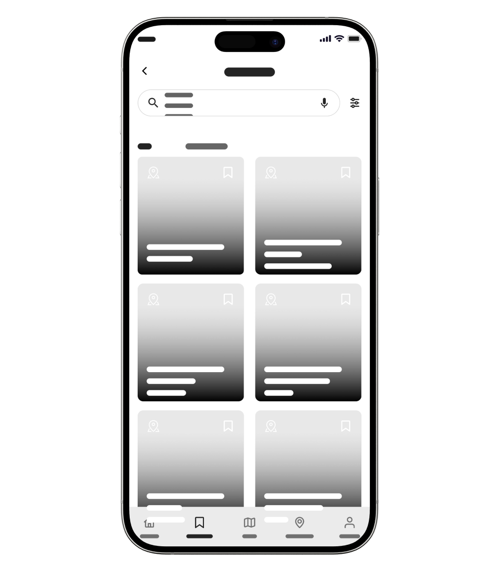
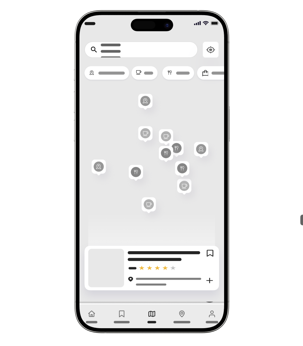
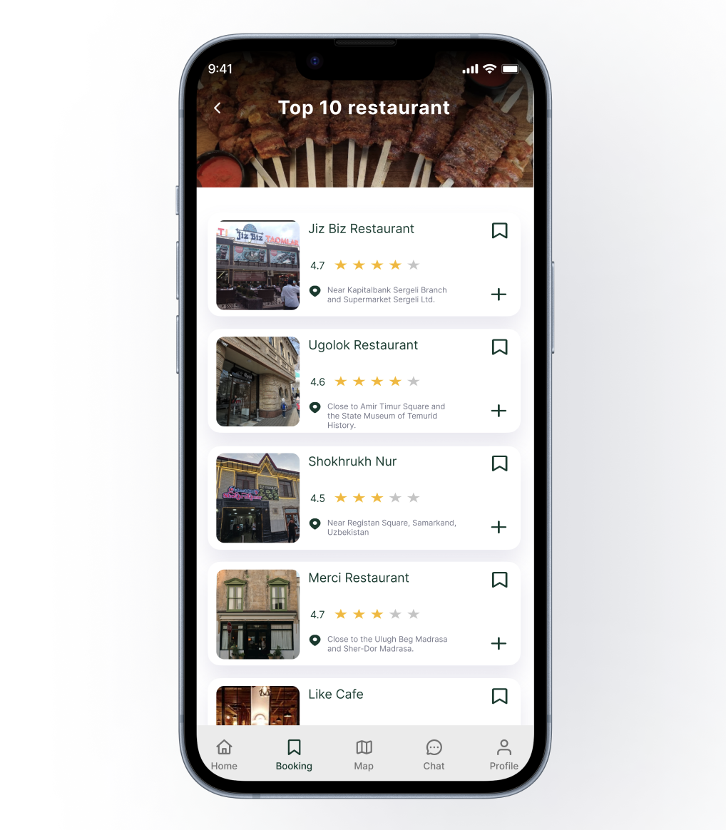
Users needed a faster way to explore and act on places without leaving the map, so I added interactive location cards directly on the screen. This allows users to view details like ratings and distance, and quickly decide where to go next without breaking their flow.
Clarifying the next step
Users weren’t always sure what to do after discovering a place, so I made key actions like save, book, and add to itinerary more visible and easier to access directly on each screen.
I also aligned these actions across the app so users can move from exploring to planning without confusion or extra steps.
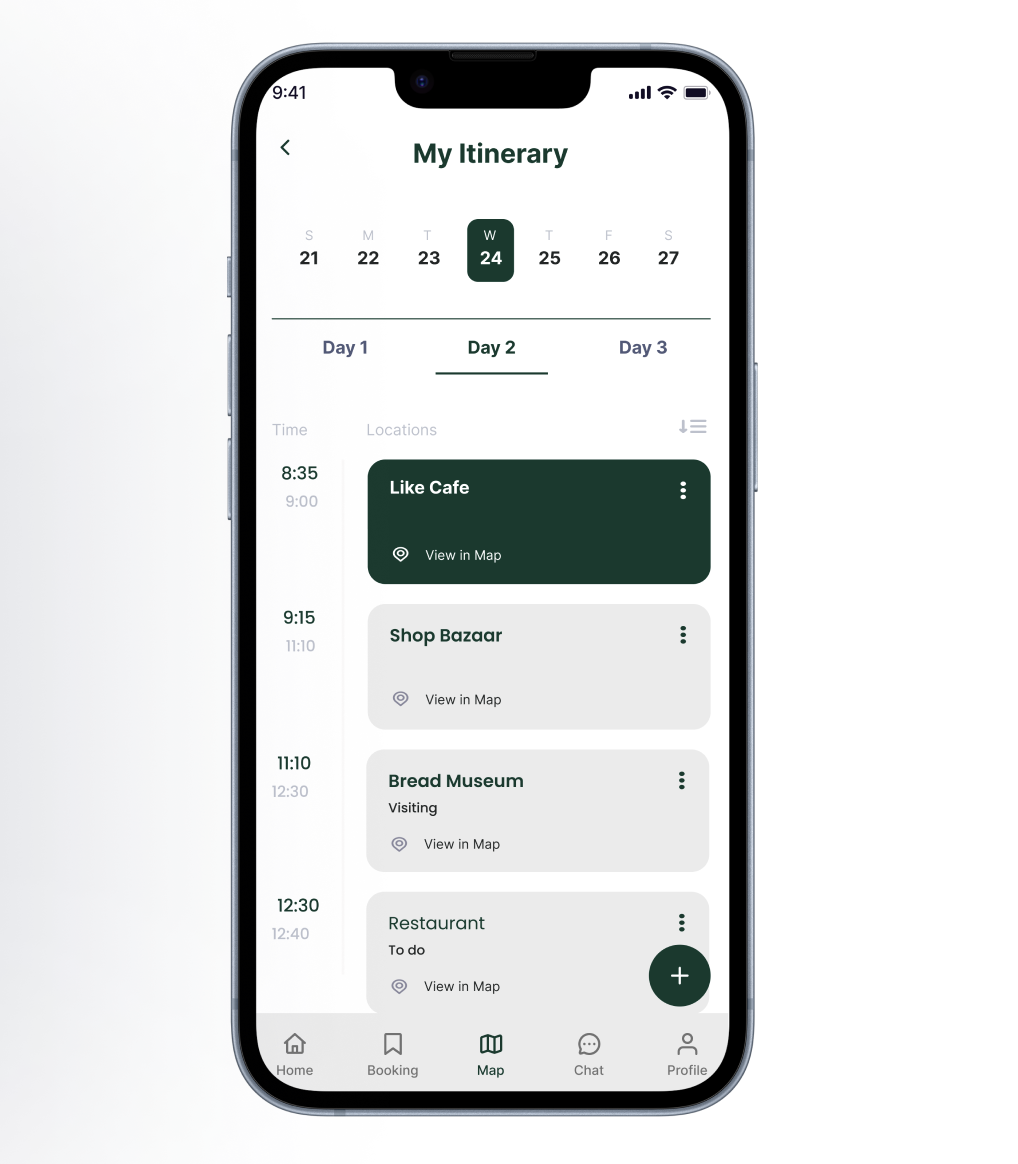
Simplifying trip planning
Planning a trip can get overwhelming quickly, so I kept the itinerary simple and easy to manage.
Users can add places and organize their day without feeling like they’re building something complicated.
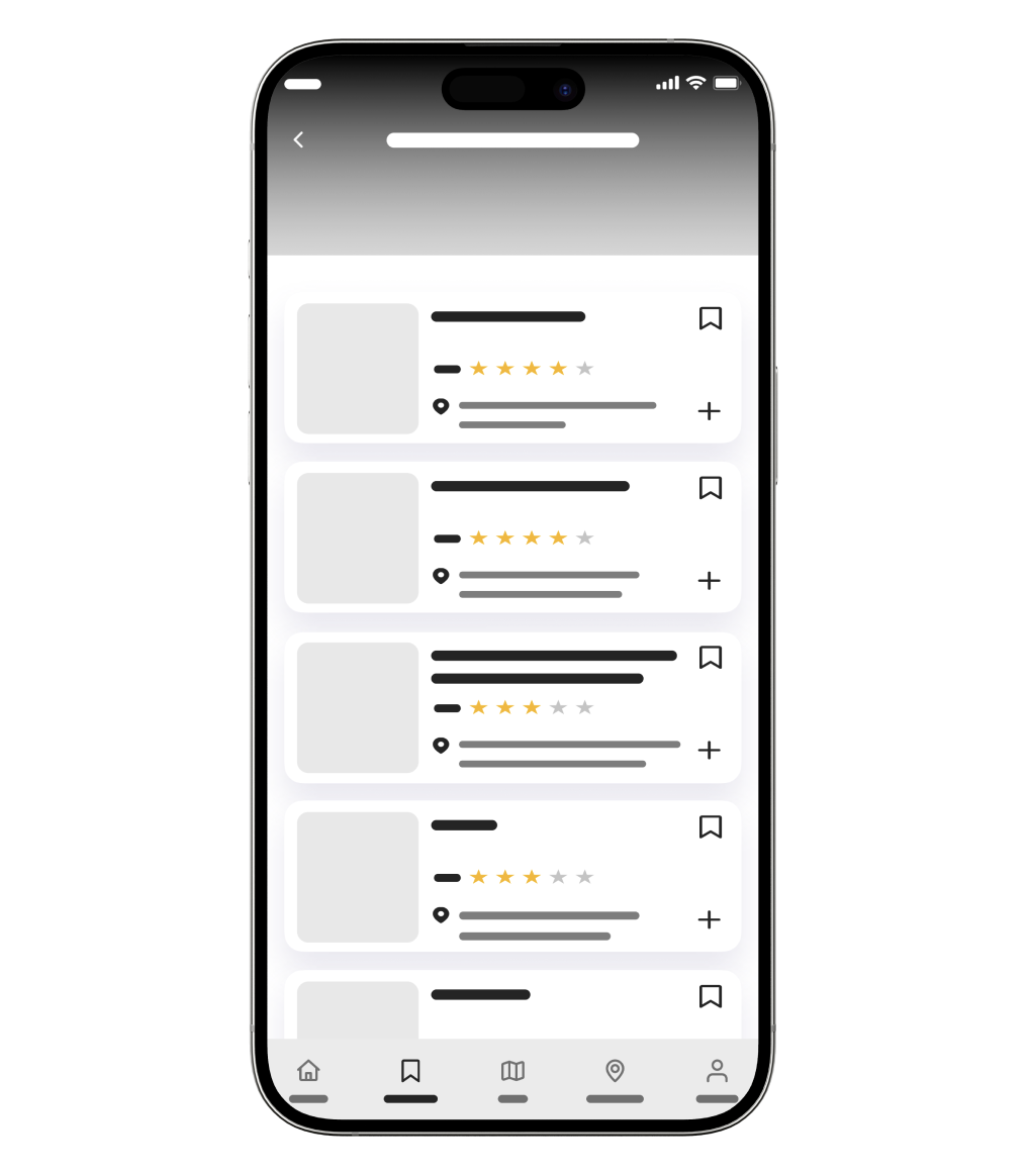
Designing for real-time decisions
Most travel decisions happen on the go, so I focused on making key information easy to scan.
Things like ratings, location, and categories are visible right away, helping users quickly decide where to go next.
Make it stand out.
Conclusion
What I learned
Working on UzGo made me realize the problem isn’t that travel apps don’t exist—it’s that they don’t work well together. Most of the frustration came from switching between tools, not from a lack of features.
I also learned how important it is to keep things simple. The more I reduced steps and kept everything connected, the more natural the experience started to feel.
What I want to improve on
I’d like to push my research further, especially with interviews. I was able to find clear patterns, but I want to get deeper insights that go beyond what I already expected.
What’s next
If I continued this project, I would refine features like trip planning and discovery to feel even more personalized.
I’d also explore how UzGo could expand beyond Tashkent while still keeping the experience simple and easy to use.
Thank you
Thanks for taking the time to go through this project.
-
![ACC Logo]()
Course Flow
-
![Easy Health Logo In Black Test and Green leaf]()
Easy Health